UPDATE:Â the project is no longer supported, since it’s part of RawGraphs. Check it out here: rawgraphs.io.
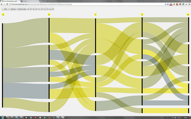
Fineo is a web application which implements a visualization technique based on the visual model of Sankey diagrams. Fineo was born from the idea that Sankey diagrams, although developed as a technique for visualizing continuous data, may be used to represent relations between dimensions of categorical data.
Introduction
Categorical data representation is crucial for interpreting many real world phenomena. Categorical data, in fact, refers to all those data which can be grouped in categories and exactly for this reason are extremely useful for aggregating data. These categories usually do not have any specific order (except for the ordinal ones) but can be hierarchically organized and may be conditionally dependent. In the case of high-dimensional categorical datasets making sense of the relations, hierarchies and dependences of those categories can be quite a hard task.
Moreover, to be able to make sense a multidimensional dataset, an interactive approach is strongly needed so that the user will be able to filter and relate only the information he is interested into.
For this reason we developed Fineo, a web application which implements a visualization technique based on the visual model of Sankey diagrams. Fineo was born from the idea that Sankey diagrams, although developed as a technique for visualizing continuous data, may be used to represent relations between dimensions of categorical data. That is: by using Sankey diagrams’ streams it is possible to visualize relations between categories belonging to different dimensions.
Sankey Diagrams
Sankey diagrams are flow diagrams that represent flows of continuous data such as money, energy or material in a system. Fineo, instead of using the flows for this purpose applies them to represent relations between multidimensional categorical data.
This use of sankey diagrams was first developed by DensityDesign as a static infographic on the DRM project. The infographic used only two categorical dimensions, but was the base on which Fineo development started. Recently the use of sankey diagrams for comparing couple of dimensions has become quite popular, even though it has never been formalized. From that experience we understood that the same concept may be applied to more dimensions and that we needed a software to automatically generate the visualization layout.
We have chosen to conceptually base Fineo on sankey diagrams for three main reasons:
- Sankey diagrams layout description is network-like – Sankeys are described by a network-like structure: they are constructed based on node and weighted edges. This may be considered to be the easiest and more intuitive way to think about representing relations between sets of data.
- Flows are not atomized – Flows in sankey diagrams act much more like “rivers” (as opposed to threads) in which you lose memory of the previous steps. This can be useful in those cases in which the user is more interested in relating different data dimensions next to each other more than centering the visualization partition around a leading dimension. Sankey diagrams favour comparisons between pair of dimensions but more importantly favour the understanding of the global flow distribution within a whole phenomenon.
- Flows may stop or start wherever they need to – Sankey diagrams’ flows are not forced to be connected to every step. Fineo, although more rigidly organized than sankey diagrams, shares this feature: it is able to visualize “dead ends”.
Fineo and ParSets
Fineo, as sankey diagrams, does not subdivide categories after every step. It instead treats the connection like “liquid” flows: after every axis is not possible to know from where that flow is coming from.
Fineo has been developed to create a whole vision of a data set using two or more dimensions rather than for profiling data based on a leading dimension.
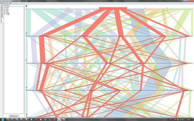
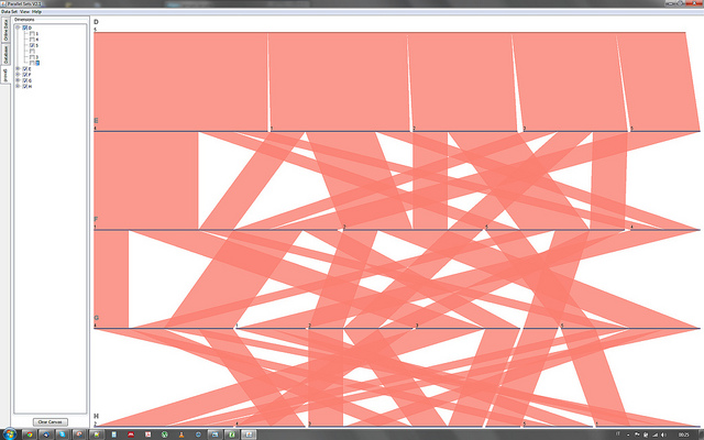
While Fineo visually reminds of Parallel Sets, the work of Bendix and Kosara visualize a specific tree structure. ParSets, in fact, subsequentely atomizes its ribbons based on the upmost (the first) dimension chosen.

Fineo, instead, is much more network-like. Individual categories are nodes, grouped under their dimension. The number of nodes belonging to the same couple of connected categories dictates the weight of the flow.

This means that in Fineo axes are independent from each other and they may be reordered in each sequence so that the user may compare different pair of dimensions. As noted before Fineo does not favour a dimension over another: the connections are made only on adjacent axes and the visualization can be read in both directions (left to right or vice versa).
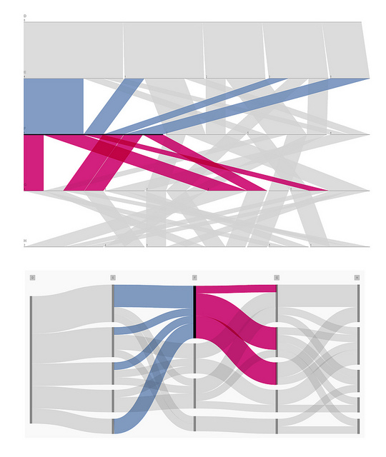
In the next images a filter on the first category is applied to show the difference between the two models:
Fineo Filtering:

ParSets Filtering:

To further understand the difference we can highlight the number of in/out ribbons in ParSets (4/6) and the in/out flows in Fineo (4/3) – dimension F/category 1

ParSets create the double (in this case) of Fineo’s connection because it is keeping track of the previous step subdivisions. While this can be very useful we decided to develop Fineo in a way that it only cares about the number of nodes (categories) of the arrival step.
Valuable as a production tool
Fineo has been developed keeping in mind designer’s need. We provided Fineo with an export option in vectorial shapes (PDF file output) to streamline the design and editing of the visualization. This way the PDF file generated can be opened in all the major vector drawing programs (such as Adobe Illustrator and Inkscape) for further refinement.
For this reason Fineo proves valuable both as an analytical working tool and as a production tool for presentation purposes.
The application has been used as an analytical tool for the Mapping the Republic of Letters project at Stanford University.


