‘Brain Houses’ was commissioned to DensityDesign by Domus (well-known monthly magazine of architecture, design, interiors and arts) on summer 2010.
It was published on issue 938 (July-August 2010) and it was intended as the graphic complement of an article written by architect Italo Rota about three interior designs «derived from the mind and not from the hand».
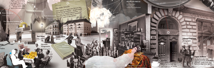
As the article itself, the visualization is the intricate story of three “interiéurs” and their three auteurs: Sigmund Freud‘s study in Vienna which is defined as ‘The house of the mind’, Ludwig Wittgenstein‘s sister‘s house in Vienna, or ‘The number house’ and Pierre Chareau‘s ‘Maison de verre‘ (‘The glass house’).
The research side in this project mostly consisted in a sort of dramatization of Rota’s interpretation of the three stories. But a lot of work was done also in the collection of the needed documentation about the houses and the protagonists who, in a lot of ways, were gravitating towards Freud, Wittgenstein, Chareau and the houses themselves. But, maybe, the greatest effort in the making of this visualization has been put into drafting a network of connections between all the elements mentioned above. You can have a look at it below (click to see it in a larger size directly on our flickr set).
A diagram to understand
In our research process, DensityDesign is becoming always more used to produce artifacts which have the only purpose of letting us (and sometimes our clients) understand the source material we have to visualize.

In this particular case, for the visual story developed for Domus, we used the diagram to work out the complexity of having multiple and intersecting tales to tell. It helped us to keep traces of every single branch of the three main narratives and to select the ones to hold or the ones that were needed to be excluded.
Beyond that, these types of diagram (or gameboards, as we very much like to call them) fullfil an other important function: they are our only interface between us and the client. To us, drawing the diagram for them and put it in the middle of the table as a ‘discussion plan’, turned out to be a very effective method to achieve validation on our work.
Even if, in some ways, this sort of procedure doubles the volume of our work and even if it won’t be seen by practically anyone (except from you, dear readers of our website) we are firmly persuaded to go on experimenting with this method and we warmly invite you to grab this idea and make it yours, on the only condition that you share with us your experience with it (email us!).
Images to let understand
From the standpoint of visual choices, ‘Brain Houses’ is conceived after the idea of panorama as an ideal form of depicting space with whom the eye wanders around, in a sense, and you (the observer) decide where to look. This is a feature of panorama, or landscapes, which we chose to let the final viewers be the masters of their own narration: because there is no such thing as a true story, but only plausible ones.
There are no starting point or end of the line in our visualization. And we meant it. There are only three main ‘attractors’ (Freud, Wittgenstein, Chareau) and then it’s your choice where to wander, which part of the story you want to follow, which arguments you want to combine, how you decide to perceive the minds which created the three houses under the spotlight of this visualization.
And because to us design for narrative is a matter of engagement, inclusiveness and meaning-making, we used an expressive approach: we used images, collage, photo-composition. We emphasized the look and feel of the elements we detected in the diagram, and the result is a narrative panorama: visually consistent, mind-driven, knowledgeably engaging.

This is the final visualization. Click on the image to see it in detail on Flickr.
We have also uploaded a concept image that documents the making of this work.
Enjoy the set.
An useful fictitious dialogue
DensityDesign – Now, would you please ask us: «Why didn’t you just give a more ‘analytical look’ to the diagram?».
Dear reader – Ok, fine. Why didn’t you just give a more ‘analytical look’ to the diagram?
DensityDesign – Thank you for asking. That’s an interesting question.
Because we are convinced that images or, more in general, the ‘surface’ of a visualization cannot be seen as an epiphenomenon but has to be considered an essential part of the discourse started by the visualization itself. In our research projects we see the surface as part of the structure.
Dear reader – Sure. Wow, you succeeded in linking the least visited page on Wikipedia using a word of greek origins which nobody knew it could exist. But seriously, appearance can be illusory and images are sometimes too many-sided to be interpreted in a predetermined way…
DensityDesign – Of course appearance can be illusory, vague, superfluous. The surface of things can give you the illusion of knowing them just by looking at them. But the same illusion of easy knowledge can be induced by reducing things to their primordial structures: the depth obtained by robbing things of their qualities can be as much illusive as the superficiality of their image.
Dear reader – So are you telling me that the depth induced by the diagram is in fact only a perceived one and that with a so-called ‘analytical look’ you lost more than you get with the risky expressiveness of images?
DensityDesign – Yes, we are. As English artist David Hockney once said: «Surface is illusion but so is depth».
-
Extras