DensityDesign | Communication Design & Complexity header image 4_a DensityDesign | Communication Design & Complexity header image 4_b

Entries Tagged as 'Diagram'

Complexity, Complication, Visualization and Interaction

March 24th, 2009 No Comments

According to the article of Veronique Greenwood in SEED Magazine about data visualization, complication is the problem, and interaction is the solution: “One way to solve the problem of overly complicated diagrams is to introduce interactivity.” Interactivity is also a way to escape the flatness of certain maps: “interactive displays may be much more useful [...]

Tags: Complexity · Density Design Lab · Diagram · Infovis · Representation

Fold it, it makes sense! Six stories about poverty.

February 16th, 2009 No Comments

Density Open Day 2009

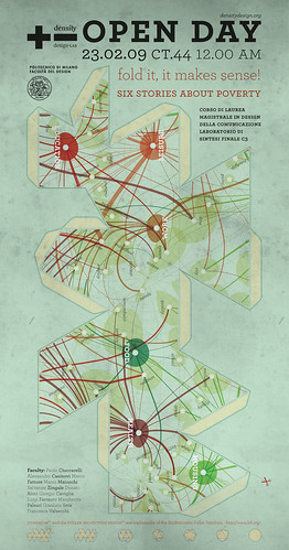
Who are the poor? Poverty is neither a number nor an index. It cannot be reduced to a line that divides those who are above and those who are below establishing a unique space for social exclusion. Poverty is a multidimensional and complex phenomenon. Its reduction to a unique representation can generate distorted visions of the phenomenon and create ineffective or counterproductive interventions.

Tags: Complexity · Decision Making · Density Design Lab · Design · Design Interventions · Diagram · Events · People

Spreading Density

February 13th, 2009 No Comments

Another step forward: one of the (art?)works done by our students has been chosen to illustrate an article in The Morning News. The title of the article is Mindfuck movies, and talks about understanding and explaining, especially when it comes to Memento, the subject of our exercise. Understanding and explaining: that’s DensityDesign!

Tags: Density Design Lab · Diagram

Jules & Jim

January 23rd, 2009 2 Comments

Often love affairs are instable, fleeting and unpredictable. It seems emotions change in a chaotic way. On this assumptions some mathematicians recently modeled a love relationship in terms of dynamic system. One of the case study of this kind of works is Jules et Jim, the autobiographical novel of Henri Pierre Roché and his cinematographic [...]

Tags: Complexity · Density Design Lab · Design · Diagram · Infovis · Map · People · Reading · Representation · Scenario · System

A challenge. Visualize This: Poverty Rate By Age in America

January 14th, 2009 1 Comment

Since the main issue of the Density Design Lab 2008-2009 is poverty, we will encourage our student to join this challenge.

Tags: Density Design Lab · Design · Diagram · Infovis · Statistic

Pulse: Visualizations of kuler colours

January 10th, 2009 No Comments

Adobe just rolled out a new feature over at Kuler. Pulse is a tool to visualize the colors used on Kuler related to country, season and tag. The color set can be scale in regard on granularity as well as the lighness of the colors.

Tags: Design · Diagram · Infovis · Map · Software · Statistic

New Year’s resolutions

December 29th, 2008 No Comments

In 2009 we should decrease our graphing addiction and increase attention to coincidences!
happy new year!

Tags: Decision Making · Diagram · Events · Icon · Infovis

Visual Literacy

December 14th, 2008 No Comments

I read Kevin Kelly article on New York Times magazine and I found the concept of Visual Literacy very interesting. Even if our society it is getting aware of the importance of visual language for our contemporary communication, visual language need more research to get to the point of being totally accepted in artefacts where traditionally we use text.

Tags: Diagram · Infovis · Reading · Representation

Project progress report 02. Systemic approach and causal loop model

November 25th, 2008 No Comments

A causal loop model has been developed in order to help understand the complex systemic structure of poverty in all its dimension. System diagramming is here a loose term used to describe the activity of conceptually representing and visualizing a system in its constitutive elements: the elements, the relationships and the system boundary distinguishing what does and does not belong to the set.
The assumption of this qualitative exercise is that poverty, and its dimensions, are the result of the dynamics between a wide variety of factors from macro-politic, to the personal behavioral patterns.
The key element of the visualization are the factors and the variables. They are the environment attributes and characteristics that have an influence level of poverty.

Tags: Complexity · Decision Making · Design Interventions · Diagram · Infovis · Map · People · Representation · Scenario · System

CityMurmur Project

November 20th, 2008 23 Comments

HAVE YOU EVER THOUGHT OF A URBAN SPACE SEEN THROUGH THE EYES OF MEDIA?
CityMurmur tries to understand and visualize how media attention reshapes the urban space and the city.

On-line newspapers, information agency, blogs and personal websites, thematic media are monitored to highlight the pattern of perceptions on the urban space. This monitoring activity leads to the creation of an atlas that will produce – in real-time – different maps based on news sources, themes, and time. The atlas allows users to understand the urban space as a function of media attention and biases and social and cultural diversity of the city itself.
The goal of the project is to show how different media differently describe the urban space through the attention that is payed on each street of the city. In the hypothesis of the increasing importance of the on-line presence in contemporary society, a media geography has been generated intersecting the media scape with the geographical reality of the city.

Tags: City · Complexity · Diagram · Events · Infovis · Map · Statistic · System