Blog
Friday, July 17th, 2015
San Marino Design Workshop

Within the rich San Marino Design workshop 2015 agenda organized by the Università degli Studi di San Marino and the Università IUAV di Venezia, I was invited to hold an intensive 5 days workshop about Open Data and Data Visualization.
The aim of the workshop was to understand how the data released by the public administration (not in Open data format yet), combined with other data sources and the use of data visualization, can help to unveil and describe unexpected aspects of a territory.
In the first phase of the workshop the 13 participant, divided in 4 groups, had to examine the datasets released by the public administration of San Marino about different topics (turism, commercial activities, demography, employment, etc) and choose a subject to explore through data visualization. In a second phase the students had to think about other possible data sources (social media, data released by civic organizations, etc.) that could be combined with the initial datasets in order to broaden the research and find interesting insights.
The students that decided to focus on the turism of San Marino for example, decided to combine the datasets about the turistic flows and accommodations with the metadata of the pictures taken in San Marino and uploaded on Flickr in order to see which areas of the Republic were more photographed and how the turists move on the territory.
To see the results and descriptions of the works download the posters produced by the students (only in italian sorry).
During the workshop the students had the possibility to test some new features and charts of the new version of RAW (more news coming soon).


I would like to thank:
The Università degli Studi di San Marino and the Università IUAV di Venezia and all the people who organized the workshop.
Elisa Canini, the tutor that helped me in the organization and the teaching activites of the workshop.
All the participants that attended the workshop with great enthusiasm: Lucia Tonelli, Bucchi Maria Cecilia, Grenzi Paola, Bocci Chiara, Falsetti Duccio, Leurini Luca, Marazzo Hillary, Barone Raffaella, Lampredi Luigi, Mosciatti Raffaele, Ponsillo Nunzia, Sotgiu Maria Chiara,Moccia Antonio, Michela Claretti.
Thursday, April 30th, 2015
Depiction of cultural points of view on homosexuality using Wikipedia as a proxy

Preliminary research questions
Which aspects of a controversy is a semi-automated analysis able to return? Is it possible to depict the different cultural points of view on a controversial topic analysing Wikipedia? Can the results be used to improve awareness on the existing differences among cultural approaches on the controversy?
These are the principal questions that I’ve put as starting point of my research project and to whom I hope to be able to provide an answer to with the publication of obtained results.
Structure of the research
CHOICE OF A CONTROVERSIAL TOPIC – As first step, I chose a subject characterized by different connotations according to specific cultural backgrounds of communities: homosexuality seems to be a critical theme for many culture and each nation has an own level of tolerance of it. The meeting between a separate management of the phenomenon and the self- maintenance and conduction of Wikipedia’s editions is a favourable occasion to observe not the emergence of different points of views but the simultaneous existence of several neutral definition of homosexuality.
RELEVANCE CHECK – The second step is an examination of the effective consideration of the theme verifying how many editions have a dedicated article about that and subsequently the selection of eight European communities which have a different statement versus homosexuality: (reports of Ilga-Europe association on human rights situation of LGBTI people in Europe).
DATA COLLECTION – The correspondent pages in each linguistic edition are been investigated reporting data from various features not directly connected with content. The data collected with quantitative, semantic and qualitative analyses has permitted to make a cross-cultural comparison on several aspects of debate (as user, edits and macro-areas of discussion) and returned some information about communities approach to homosexual phenomenon. The comparison is structured in five point of interest: development of discussion in time, behaviour and characteristic of user, elements of discussion, cultural interest on topic, self or global focus.
Questions and Answers – First results
1. Presence of a dedicated article in editions
How important is the phenomenon and which level of familiarity/tolerance different cultures have with it?
Presence and status of the article (Protected, semi-protected, controlled, good article, FA/featured article) are the first indicators of a discrepancy on the activity generated from the theme. Homosexuality is present in 106 language editions out of 277; in few edition the page is protected, semi-protected or controlled. Only in four language the topic has been awarded as “featured article” on the main page.

Same topic means same information?
Comparison of basic information of pages: entry date and quantity of information contained of each edition selected. Is there any connection between length of description and degree of acceptance of homosexuality in cultures? As degree of tolerance I used data coming from the reports of Ilga-Europe association on human rights situation of LGBTI people in Europe. While there is not a clear relationship, the Russian edition stands out for the size of the page compared to the degree of tolerance.

How much time after the entry of the article is the discussion started? How many editors participate also in talk pages?
The birth of a talk page is linked to the needs of users to find an agreement on the correctness of the content to share. The reduction of the gap between the article’s insertion date and the birth of its talk page can be viewed as an indicator of a different need to debate? This interlude decreases with time: the talk page of the English article was introduced a year and a half later, while in other editions it took less than twelve months. The reduction of margin was due probably to an increase of the noise generated by homosexuality whose criticality in 2001 was not the same of 2004: the number of laws worldwide relating to homosexual persons is increasing. The percentage of editors who participate in talk page also shows a divergence in the involvement degree in controversy. In the Russian page, which is connected to the nation who have the lower tolerance toward homosexuality, the need of user to bring the debate to a second level seems to be stronger than in the others.

2. Development of discussion in time
Has the discussion a regular pattern or shows irregular peaks? Periods of high dispute coincide with high involvement?
A coincidence of trends suggests an intersection of interests between communities and therefore an increase of the discussion linked with events of cross-cultural relevance. However, the analysis of edits for month made on homosexuality pages brings to light a debate that is clearly far to be connected between editions. Each edition follows its own line of debate whose peaks could be linked with particular local events or issues that are not relevant for the other cultures. The causes of a conflict in a page just few times exceed local barriers coming to be cross-cultural disputes.
Which period has gained more participation? Many edits coincides with a high involvement?
A significant gap between number of edit and number of participating editors is signal of a heated dispute, identifiable with an edit war. An equality of the two quantities indicates a co-productive behavior of users, which participate without discussing; on the other hand, an ample variance symbolizes a long negotiation debate inside the community and highlights the difficulty of users in finding a common neutral view on homosexuality definition. In English and French pages the number of editors involved is similar to edits sum which means that there is an equal participation of users in highest discussion periods. In the other cases, a more critical perception of the theme causes a more drastic diatriba.
Which linguistic edition of the article generates more debate?
The presence of many discordant views on content’s neutrality causes an increase of edits therefore a higher average of edits for user. The data analysis allows to identify the pages with a more frequent tendency to the debate: the editors of Russian and Hungarian pages seems to be less prone to compliance when it is for the definition homosexuality.

First conclusions
These first analyses on relevance and chronological development of controversy associated with homosexuality shows that there isn’t an evident overlapping of discussion between editions. The different cultural perception of homosexuality influences the participation of users in debate and, as a consequences, produces disconnected periods of discussion between editions: each timeline seems to reflect its own community diatribes on topic and not an involvement in a common discussion with others.
Thursday, April 9th, 2015
Cross-cultural neutrality about controversy? The Wikipedia case
")
The project
Hi! I’m Marta and my thesis project consists in a cross-linguistic analysis of treatments and declinations of a controversial topic between different editions of Wikipedia. The aim of the research is to discover if the debate linked to a controversial page coincides or differs in the various languages and therefore how high is the percentage of incidence of the culture associated with them in the generation of contents. The final output of the project is a tool (set of visualizations) which allows to compare visually several aspects of the discussion built on a chosen controversial theme and increase the general awareness of readers on different cultural interpretations of it.
Cross-linguistic Wikipedia: NPOV and cultural background
Wikipedia, as an online encyclopedia whose contents are produced and updated entirely by users, may be considered and studied as a mirror of modern society. One of the most important conditions required in the production of content is the maintenance of a neutral point of view (NPOV) to avoid any personal opinion, a difficult aim for a collaborative articles production.
Wikipedia is currently available in 288 language editions (April 2015) and each edition is organized and developed separately from the other, based on cultural predispositions of the countries from which it takes voice. The neutrality of articles should give an objective value and universal to content that goes beyond the origins and ideologies of each editors. However, despite the article was written in accordance with NPOV policy, there are cases where the definition of the topic can’t be separated from the consideration that the different cultural backgrounds have of it.
The aim of my thesis is to verify if the debate linked to a controversial topic coincides or differs in the various language editions and therefore how high is the percentage of incidence of the culture of origin on the generation and treatment of the content. The output of the project is a tool which allows to compare, between the editions, various aspects of the debate on a chosen controversial topic.
Bibliography of cross-linguistic studies about Wikipedia
Many researches have made Wikipedia their object of study analyzing the pros and cons of this archive of knowledge generated collaboratively. Only recently the cross-linguistic aspect of Wikipedia seems to have gained interest in the sociologists community and this has led to a proliferation of studies, even if comparative researches are still limited.
The studies analyzing the cross-cultural aspect of Wikipedia can be substantially divided in two groups (Bao & Hecht, 2012): projects studying the multilingual behaviour on Wikipedia and projects that attempt to equalize information between the editions. But how different is the approach of communities in generating a shared knowledge? Is possible speak of a “global consensus” (Hecht & Gergle 2010) in a particular encyclopedic context such as Wikipedia?
A detailed analysis of the existing research projects on cross-cultural Wikipedia has permit to identify four recurrent thematic areas of study defined by the aspects examined:
- SEMANTIC ANALYSIS / TEXT SIMILARITY
- INFORMATION QUALITY/EQUALITY
- POLICY AND REGULATION
- CULTURE AND BEHAVIOR
Semantic analysis / text similarity
The primary aim of the many researches is to see if different language communities tend to describe the same argument in a similar manner. For this purpose the method used is the extraction and comparison of concepts / entities, identifiable with interlink, (Bao, Hecht et. 2012; Hecht & Gergle, 2010; Massa & Scrinzi, 2010) and the following comparison of their application (Adafre & De Rijke 2006). This kind of study is able to bring out the stereotypes that a nation or culture has towards another, if the external point of view on a culture coincides with the idea of this culture of itself (Laufer, Flöck et al., 2014) rather than to observe the cultural interpretation and level of involvement on a particular topic (Kumar, Coggins, Mc Monagle; Otterbacher, 2014).
Information quality/ equality
The quality of information of a collaborative knowledge is one of the most shared doubt when talking about Wikipedia. Studies that deal with this problematic in a cross-linguistic analysis tries to determine the quality indices of communities, as the amount of information provided (Adar & Skinner et al., 2009; Callahan & Herring, 2011)or the development of the categories structure (Hammwöhner, 2007), and compare them between editions. Being Wikipedia’s content a kind of knowledge produced by divergent cultural communities, could emerges a sort of dissonance in interest, quality criteria and definition of neutrality that not always coincide between editions (Laufer, Flöck et al., 2014; Stvilia, Al-Faraj et al., 2009; Chrysostom, 2012; Rogers & Sendijarevic, 2008).
Policy and regulation
Each edition has a self-management not necessarily connected with others and this aspect is reflected in both the definition and application of standards. The pages used to explain rules and characteristics of the platform, such as the production of content by Bots (Livingstone, 2014) and the maintenance of a neutral point of view (Callahan, 2014), show a strong connection with the cultural background of the community behind the contents and follow its behaviours and conduct in real life.
Culture and behavior
Other research focuses instead on a qualitative analysis of the different way of managing the production of content and the priority given by the community to certain issues. The collaboration between users follows different rules of conduct: the attitudes of courtesy, the management of disagreements or conflicts and the attention to contents accuracy reflect the culture and customs of the community (Hara, Shachaf et al., 2010). Many studies have noted a correspondence of conduct among nations with a similar score according to the “cultural dimensions” of Hosfede: power distance, tendency to individualism or collectivism, feminist or male-dominated society and uncertainty management (Pfeil, Zaphiris et al., 2006; Nemoto & Gloor, 2011). The cultural background also determines the predilection concentrate attention and therefore discussion on certain issues rather than others (Yasseri, Spoerri et al., 2014): the topics “close to home” tend to receive more interest (Otterbacher, 2014) and, in case of cross-cultural discussion, the cultures involved are determined to enforce their own version on the other (Rogers & Sendijarevic, 2008; Callahan, 2014).

Some of these researches have produced a tool as final output: these tools permit to compare articles/threads from various editions and return visually their overlaps and discrepancies. These instruments break down the language barriers allowing a cross-cultural consultation of different topics and offering to users a complete overview of information. They also help to build in the reader of Wikipedia a greater awareness of the cultural differences existing in society. Here is a brief description of existing (or in development phase) instruments:
Manypedia (http://www.manypedia.com/)
Online tool that allows to compares simultaneously two language versions of the same article. Manypedia extracts from both some basic data of the page as the most frequent words, the total number of changes and publishers, the date of entry of the article, the date of the last change and the most active publishers enabling the user to confront the salient features of the two articles.

Omnipedia (http://omnipedia.northwestern.edu/)
With this tool the reader can to compare 25 language editions of Wikipedia simultaneously highlighting similarities and differences. Information is lined up to return a preview of usage of the concepts for each language, eliminating all obstacles due to language barriers. The entities (link) linked to the most discussed topics are extracted and translated into an interactive visualization that shows which topics are mentioned by linguistic editions and the sentences of the page where they appear.

SearchCrystal (http://comminfo.rutgers.edu/~aspoerri/searchCrystal/searchCrystal_editWars_ALL.html)
Set of visualizations which displays differences and overlaps between the 100 articles most discussed identified in 10 language editions of Wikipedia in relation to the number of changes.

Wikipedia Cross-lingual image analysis (https://tools.digitalmethods.net/beta/wikipediaCrosslingualImageAnalysis/)
By entering a URL linked to a Wikipedia article the tool tracks all the languages in which this article is available and collects the images present in the pages. The output is a panoramic view of the topic by images: it provides a cultural interpretation of the argument related to the different languages.

Terra incognita (http://tracemedia.co.uk/terra/)
Terra incognita collects and maps the articles with a geographic location in more than 50 language editions. The maps highlight cultural prejudices, unexpected areas of focus, overlaps between the geographies of each language and how the focus of linguistic communities was shaped over time. The project allows the comparison of different features between languages through filters: language (any language has an assigned colour), intersection (shows the location of articles appearing in more editions), translated articles, links (highlight areas whose articles have been translated into several languages).

Open questions
The common aim of these studies is discovering, if it exists, a meeting point between cultures and their point of views as they are told on Wikipedia. The technical analysis of terms unified with social studies help to achieve this goal but what kind of horizontal research and comparison should be made to go deeply in the discovery of a cross-cultural controversy? Are there other researches available introducing new aspects of cross-cultural analysis?
Bibliography
Adafre S.F. and De Rijke M., Finding Similar Sentences across Multiple Languages inWikipedia, 2006
Adar E., Skinner M. and Weld D.S., Information Arbitrage Across Multi-lingual Wikipedia, 2009
Bao P., Hecht B., Carton S., Quaderi M., Horn M. and Gergle D., Omnipedia: Bridging the Wikipedia Language Gap, 2012
Callahan E. and Herring S.C., Cultural Bias in Wikipedia Content on Famous Persons, 2011
Callahan E., Cross linguistic neutrality Wikipedia’s neutral point of view from a global perspective, 2014
Crisostomo A., Examining perspectives on “Abortion” within the EU through Wikipedia, 2012
Hammwöhner R., Interlingual aspects of Wikipedia’s quality, 2007
Hara N., Shachaf P. and Hew K., Crosscultural analysis of the Wikipedia community, 2010
Hecht B. and Gergle D., Measuring Self-Focus Bias in Community-Maintained Knowledge Repositories, 2009
Hecht B. and Gergle D., The Tower of Babel Meets Web 2.0, 2010
Kumar S., Coggins G., Mc Monagle S., Schlögl S., Liao H.T., Stevenson M., Bardelli F. and Ben-David A., Cross-lingual Art Spaces on Wikipedia, 2013
Laufer P., Flöck F., Wagner C. and Strohmaier M., Mining cross-cultural relations from Wikipedia – A study of 31 European food cultures, 2014
Livingstone R., Immaterial editors: Bots and bots policier across global Wikipedia, 2014
Massa P. and Scrinzi F., Exploring Linguistic Points of View of Wikipedia, 2011
Massa P. and Zelenkauskaite A., Gender gap in Wikipedia editing – A cross language comparison, 2014
Nemoto K. and Gloor P.A., Analyzing Cultural Differences in Collaborative Innovation Networks by Analyzing Editing Behavior in Different-Language Wikipedias, 2011
Otterbacher J., Our News? Their Events?, 2014
Pfeil U., Zaphiris P. and Ang C.S., Cultural Differences in Collaborative Authoring of Wikipedia, 2006
Rogers R. and Sendijarevic E., Neutral or National Point of View? A Comparison of Srebrenica articles across Wikipedia’s language versions, 2012
Stvilia B., Al-Faraj A. and Yi Y.J., Issues of cross-contextual information quality evaluation – The case of Arabic, English, and Korean Wikipedias, 2009
Yasseri T., Spoerri A., Graham M. and János Kertész J., The most controversial topics in Wikipedia: A multilingual and geographical analysis, 2014
Friday, September 5th, 2014
The Big Picture
A visual exploration of the reciprocal image of Italy and China observed through the lens of Digital Methods.
After Borders and Visualizing Controversies in Wikipedia, I introduce here The Big Picture, my M.Sc Thesis for the Master in Communication Design at Politecnico di Milano. Together with the project we will also introduce http://thebigpictu.re, the website showcasing the research. The project has been carried out under the supervision of professor Paolo Ciuccarelli and the co-supervision of YANG Lei, Curator and Exhibition Director at China Millennium Monument Museum of Digital Art of Beijing.

Introduction
The project, starting from my personal experience of living in China for more than one year, aims to examine the peculiarities of the narrative of both countries in one another’s web space. It consists in the collection, categorisation and visualisation of 4,800 images from the reciprocal national internet domains of Italy and China.
The exponential growth of non-professional and professional media producers has created a new cultural situation as well as a challenge to our normal ways of tracking and studying culture (Manovich, 2009). Thanks to this massive production of data we are able to make a number of analyses that were not possible previously. In a context where the language barrier represents a big obstacle, images can be the medium for cultural analysis by taking advantage of both the visual properties and their intrinsic storytelling capabilities.
The questions we were interested in were, first, whether we could use the collection of images found in the reciprocal web of Italy and China as a tool to investigate the perception of respective national identities, and, second, what kind of insights these images would provide.
Methods
The background to this research combines two approaches developed by the Digital Methods Initiative of Amsterdam and the Software Studies Initiative of New York. The first method, which considers the digital sphere both as a measure of the impact of new technologies on the user and as a resource used by the real world as a political and social space (Weltevrede 2009), introduces the term “online groundedness” in an effort to conceptualise the research that follows the medium, to capture its dynamics and make grounded claims about cultural and societal change (Rogers 2013, 38). The second approach focuses on research into software and the way computational methods can be used for the analysis of massive data sets and data flows in order to analyse large collections of images. “If media are ‘tools for thought’ through which we think and communicate the results of our thinking to others, it is logical that we would want to use the tools to let us think verbally, visually, and spatially.”(Manovich 2013, 232)
Selection of the Sources
Having decided to examine the perceived identities of these nations in their mutual web-spaces through images and to pay close attention to how this identity is “broadcasted”, search engines, being a crucial point of entrance and exploration of the web, seemed a natural place to start. The two main sources for the collection of data were therefore the two main image-search engines of the two countries. Google’s position as the main search engine in Italy (we refer here specifically to the national domain google.it), is mirrored by Baidu in China, which commands about two-thirds of the booming search market there[7]. To add a further layer to the research, we employed Google’s advanced search instruments to conduct a second series of queries limited to a selection of domains concerning specific news websites that carried particular meaning for either country. Thus the collection included 2,400 images for each data set obtained by searching for the translated name of one nation in the local nation’s web space: 900 images retrieved directly from the respective search engine and 300 from five different news websites scraped via the search engine.
Data Collection
In order to ensure that research on the images was as objective as possible, it was crucial to isolate it from personal computer and search engine use. Some rules were implemented for this purpose:
- Log out from any Google service
- Delete all customisation and localization services related to social networks and browser history
- Empty the search engine’s cache
Because data collection from the Chinese web was done in mainland China, it was not necessary to use proxy or other software to simulate the originating location of the queries. Each query was conducted from the country of the specific domain. The collection of images was carried out between 01-15/02/2013 for images pertaining to China, and between 01-15/03/2013 for images regarding Italy. The period in question is fundamental for the analysis of the content. The results show a combination of collective memories, everyday narratives and the peculiarities of each day: a sampling of separate moments, seasons, amplifications and contractions of time as they appeared at the instant in which they were harvested.
Data Processing
Before beginning to visualise, it was necessary to understand all the data enclosed in the images. We first measured the properties in each image by using the QTIP digital image processing application that provided us with measurement files listing the mean values of brightness hue and saturation in each image. Then, to provide a qualitative dimension to the research, the images selected were manually categorised. They were organised into a hierarchical and multiple taxonomy. This allowed us to track the characteristics of each image and identify the main thematic clusters. We ended up with around 100 sub-categories belonging to seven main categories: Architecture, Disaster report, Economics, Nature, Non-photo, Politics, Society, and Sport.
Visualizations
The first intention was to take a step back and compare the images of the two datasets in relation to their visual features. We relied on the Cultural Analytics tools and techniques developed by the Software Studies Initiative at the University of California, San Diego. By exploring large image sets in relation to multiple visual dimensions and using high resolution visualisations, the Cultural Analytics approach allows us to detect patterns which are not visible with standard interfaces for media viewing. In contrast with standard media visualisations which represent data as points, lines, and other graphical primitives, Cultural Analytics visualisations show all the images in a composition.

These representations allow us to identify easily the points of continuity and discontinuity between the visual features of the two data sets, while selective ImageMontages quantify the differences according to each step of the value. As we can see from the visualisations, each nation has a specific Local Colour: visual attributes and dominant tones, which relate to specific cultural territories.

A specific visual model was then developed to visualise the categories and its subcategories. It shows the main category as the central bubble around which the sub-keywords are disposed in circles for the identification of relevant issues. Each image is tagged with one or more keywords/sub-keywords, and the dimension of each bubble is proportional to the number of images tagged with a keyword or sub-keyword.

In order to compare the relevance of each keyword to each of the sources, we made a series of bar charts. Each one represents the profile of a single source. In this way we could easily contrast the different “vocations” of the sources by highlighting the space given to each topic.

The Website
The conclusion of our experimental project has been the creation and development of the website http://thebigpictu.re where the main visualisations have been collected. In the process of creating this interface our focus has remained on the same idea from which this project originated: to increase awareness of the way we see and the way we are seen by a culture radically different from our own. This was done by making a tool which makes the topic comprehensible to outsiders, without the need for simplification, as well as to specialists in the field.

From a data visualisation point of view, the biggest challenge was to find an appropriate structure: simplified enough to show the big picture emerging from the data and detailed enough to preserve all the interesting details in the data. We acted on this in two ways: first, we decided to set up the narration consistently on a comparative level; and second, to give the user a tool for a multifaceted exploration of data. Keeping the visualisation and the storytelling on a comparative level helped to keep the exploration clean and structured, which also enabled us to explain each level of the research.

The narrative leads the user into a more in depth engagement with the data where own hypotheses can be formulated and tested. To make this possible we realized the exploration tool, a personal instrument for navigating the data set. It aims to enrich current interfaces with additional visual cues about the relative weights of metadata values, as well as how that weight differs from the global metadata distribution.

To conclude, we can say that the work allows the user not only to explore all the singular elements of the database but also to focus on the database as a whole. We hope that this work will provide insight into the big picture for the general reader while offering the specialist a practical tool to test hypotheses and intuitions. As the title states, the overall purpose and outcome is to show a big picture including all the facets that make it unique.
Full Thesis
For any comment or suggestion please feel free to contact me at giuliofagiolini@gmail.com or the DensityDesign Lab. at info@densitydesign.org.
Sunday, August 3rd, 2014
Borders. A geo-political atlas of film’s production.

Hi there! I’m Giovanni and with this post I would like to officially present the final version of Borders, my master degree developed within Density Design in particular with professor Paolo Ciuccarelli and the research fellows Giorgio Uboldi and Giorgio Caviglia (at time of writing PostDoc Researcher at Stanford University).
Since the beginning the idea was to create some visual analysis of cinema and everything related to this industry but the first question that came out from our minds was, what can we actually do on this topic? what can we actually visualize?
During the past years Density Design made some minor projects on this topic ( link #01, link #02) and, if we try with a simple research, we can easily find lot of attempts on the web, the problem was that all the projects we focused on had limitations. Most of them relied on small datasets or did not answer any proper research question and, above all, none of them showed the relevance of film industry and how it affects society and social dynamics.
Fascinated by some maps I had the chance to see during the research’s months, I started to think about a way to visualize how cinema can make countries closer, even if they don’t have a proper geographical proximity. Basic idea was that in the film industry there are thousands of share production and collaborations, between actors for example, or directors, or companies and what we could actually try to do was to visualize this collaborations and to make it clear with new maps.
After a long process of revisions of our goals and research questions, we decided to focus on the relevance of the film industry inside of society during the last century, using online collected data related to this topic to visualize the evolution of relations between countries during time. Aim was to use cinema a key to read society using the dense network of collaborations inside of this industry to generate new proximity indexes between countries and, starting from them, to create new maps which can show the economical and political dynamics inside of “Hollywood” and a sort of new world based on how the film industry developed relations and connections in the last 100 years.
After decided what to do, second step was to find enough data to build up a relevant analysis. There are lot of platform where you can find informations about movies, such as Rotten Tomatoes and IMDB. We selected two main sources for this project, the Internet Movie Database and Wikipedia, both of them are based on user generated content giving us the chance to actually see how movies penetrate into social imaginarium and global interest.
The first one got our attention thanks to an open subset of the whole archive (link) which contains data about more than a million of films and gets an update every six months (more or less), the second one could give us the possibility to analyse this industry in different cultures and linguistic versions and, thanks to its APIs and the related DBPedia portal, it is basically a huge container of meta-data related to movies.
INTERNET MOVIE DATABASE

Starting from its huge archive, we decided to focus on that kind of information which can give back some kind of economical and political aspect, we selected 4 specific datasets:
– Locations (all the locations known, film by film – 774.687 records)
– Companies (all the companies involved in the production, film by film – 1.632.046 records)
– Release Dates (for each film all the release dates in each country – 932.943 records)
– Languages (list of languages’ appearance in each film – 1.008.384 records)
After a huge cleaning process (god bless who invented Python) I proceeded to generate that proximity indexes I mentioned above. The process is intricate but basically really easy, all the indexes are created counting how many times movies of a country have a connection with other countries. For example, a value of proximity between France and Germany is the amount of time that inside of French movies’ production there have been involved German companies, or total amount of locations made in the German territory. What I did, for each one of the four dataset we selected, was to calculate this index for every possible couple of countries (200*200 countries circa) with the idea of using it later in Gephi (network generator software) as a “edges weight” between nodes (nations).

IMDB – LOCATIONS ANALYSIS
“Where” a shot is taken is a choice that depends on various causes, two of them are costs of production and the requirement to move to a specific place according to the film’s plot. An entire cast move to a different location to follow the film’s theme which can require specific place and sets or to save on production’s costs moving to places where, for multiple reasons, it results cheaper.
Analysing the whole list of locations recorded on IMDB, the aim is to visualize which are the countries that take advantage from these dynamics and how nations behave differently in this process of import/export of shooting.

At the same time, using the same information, an additional analysis on individual countries can be done, we can visualize the percentage of locations made in a foreign country related to the total amount of locations recorded in the archive and see how different nations behave differently (next figure) or, for example, consider only one nation production and see where it has made some location around the world generating “individual” maps.


IMDB – COMPANIES ANALYSIS
A study on collaborations between national productions and different companies shows again a sort of economical side of this world. The most interesting part of this analysis is made by a network of countries more or less attracted to each other according to a value which is a count of times that a particular connection occurred (for example amount of time that Italian movies involved Spanish companies). As we see in the next figure this network is dominated by western and economically better developed countries, it basically shows importance of a national film’s industry within the global production.

At the same time it’s interesting to focus on smaller economic systems and geographic areas, showing the historical evolution of inner dynamics. In the next figures we can see how the situation in the European continent has evolved and strongly changed during time:

And how the situation changed in a single country such as Canada, showing the percentage of Canadian companies involved in the production decade by decade:

IMDB – LANGUAGES ANALYSIS
Our opinion was that themes debated within a national film’s production are strongly connected to the history of the country and to events in which the nation itself has been involved in. Therefore a strong appearance of a foreign language in the movies’ dialogs of a specific country could represent a sort of link, a connection between different cultures and nations considered.
A bipartite network show us in the next figure how countries and languages arrange themselves mutually, according to connections between them, generating new clusters and showing relationship developed during time. It’s important to point out that, to highlight this feature, within the network has not been considered the link between a nation and its own mother language, obviously this value is numerically much bigger than any other connection and should force the network into a not interesting shape.

IMDB – RELEASE DATES ANALYSIS
In this case, available data revealed itself as messy and confusing compared to the previous ones, tracking release dates of movies in different countries is not easy and it shows another peculiarity, in the IMDB archive we can find complete data regarding most famous and biggest productions but at the same time, data regarding small national systems and less important movies are incomplete or not significant.
To develop a correct analysis of the global movies’ distribution phenomenon it was necessary to take a step back and base it on a reliable set of data. Specifically we decided to focus and analyse distribution of American movies around the world, indeed into the database they are quantitatively much more represented than the other countries and related release dates are better recorded. Furthermore we decided not to evaluate data related to TV programs and TV series, which follows different and specific ways of distribution.
We thought that the better way to verify potential trends during time of this particular aspect was to visualize in each decade how many American movies were released in any other nation and how far (days of delay) from the American release date, generating a sort of economic and cultural detachment between United States (which can be considerate as leading nation) and any other country. Supposition is that a movie is released earlier where there is more interest and therefore more chance to get a gain from it, the visualization shows how the process of distribution got faster decade by decade, from the 80’s when American movies were released in other countries after at least 6 months (average delay), to the present when Hollywood movies are released almost everywhere around the world earlier than 3 months after the american premiere.

WIKIPEDIA ANALYSIS
What we did in this last paragraph was to verify how films of each country are represented on the different Wikipedian linguistic versions through related pages, what we wanted to do was to verify the overall interest on national productions evaluating their amount of pages on each Wikipedia.
To collect necessary data we used both DbPedia (dbpedia.org) and the encyclopedia’s APIs, what we did was basically to count on every Wiki version how many movies of every country are represented with a proper page, using this value (combined with the Page Size) to create a proximity index between nations and to generate a bi-partite network and some minor visualization.


Since all the sources where the data come from are based on user generated content, what we see in these visualizations is an image of global interest in cinema rather than a visual representation of an official productions database. It could be interesting to repeat the same process on some kind of “official data” and see what are the differences between the two version.
What we have is a sort of thematic atlas which can be developed on many other different kind of data (music, literature..) while keeping its purpose, to be an observation of society (and its global evolution) trough the informations coming from an artistic movement!
For any comment or suggestion please feel free to contact me at gvn.magni@gmail.com or the DensityDesign Lab. at info@densitydesign.org.
To close this post, some work in progress pictures:


REFERENCES
Ahmed, A., Batagelj, V., Fu, X., Hong, S., Merrick, D. & Mrvar, A. 2007, “Visualisation and analysis of the Internet movie database”, Visualization, 2007. APVIS’07. 2007 6th International Asia-Pacific Symposium onIEEE, , pp. 17.
Bastian, M., Heymann, S. & Jacomy, M. 2009, “Gephi: an open source software for exploring and manipulating networks.”, ICWSM, pp. 361.
Bencivenga, A., Mattei, F.E.E., Chiarullo, L., Colangelo, D. & Percoco, A. “La formazione dell’immagine turistica della Basilicata e il ruolo del cinema”, Volume 3-Numero 6-Novembre 2013, pp. 139.
Caviglia, G. 2013, The design of heuristic practices. Rethinking communication design in the digital humanities.
Cutting, J.E., Brunick, K.L., DeLong, J.E., Iricinschi, C. & Candan, A. 2011, “Quicker, faster, darker: Changes in Hollywood film over 75 years”, i-Perception, vol. 2, no. 6, pp. 569.
Goldfarb, D., Arends, M., Froschauer, J. & Merkl, D. 2013, “Art History on Wikipedia, a Macroscopic Observation”, arXiv preprint arXiv:1304.5629.
Herr, B.W., Ke, W., Hardy, E.F. & Börner, K. 2007, “Movies and Actors: Mapping the Internet Movie Database.”, IV, pp. 465.
Jacomy, M., Heymann, S., Venturini, T. & Bastian, M. 2011, “ForceAtlas2, A continuous graph layout algorithm for handy network visualization”, Medialab center of research.
Jessop, M. 2008, “Digital visualization as a scholarly activity”, Literary and Linguistic Computing, vol. 23, no. 3, pp. 281-293.
Jockers, M.L. 2012, “Computing and visualizing the 19th-century literary genome”, Digital Humanities Conference. Hamburg.
Kittur, A., Suh, B. & Chi, E.H. 2008, “Can you ever trust a wiki?: impacting perceived trustworthiness in wikipedia”, Proceedings of the 2008 ACM conference on Computer supported cooperative workACM, , pp. 477.
Latour, B. 1996, “On actor-network theory. A few clarifications plus more than a few complications”, Soziale welt, vol. 47, no. 4, pp. 369-381.
Manovich, L. 2013, “Visualizing Vertov”, Russian Journal of Communication, vol. 5, no. 1, pp. 44-55.
Manovich, L. 2010, “What is visualization?”, paj: The Journal of the Initiative for Digital Humanities, Media, and Culture, vol. 2, no. 1.
Manovich, L. 2007, “Cultural analytics: Analysis and visualization of large cultural data sets”, Retrieved on Nov, vol. 23, pp. 2008.
Masud, L., Valsecchi, F., Ciuccarelli, P., Ricci, D. & Caviglia, G. 2010, “From data to knowledge-visualizations as transformation processes within the data-information-knowledge continuum”, Information Visualisation (IV), 2010 14th International Conference IEEE, , pp. 445.
Morawetz, N., Hardy, J., Haslam, C. & Randle, K. 2007, “Finance, Policy and Industrial Dynamics—The Rise of Co‐productions in the Film Industry”, Industry and Innovation, vol. 14, no. 4, pp. 421-443.
Moretti, F. 2005, Graphs, maps, trees: abstract models for a literary history, Verso.
Van Ham, F. & Perer, A. 2009, ““Search, Show Context, Expand on Demand”: Supporting Large Graph Exploration with Degree-of-Interest”, Visualization and Computer Graphics, IEEE Transactions on, vol. 15, no. 6, pp. 953-960.
Wednesday, July 30th, 2014
Who visualizes Wikipedia?
Overview of the academic studies applying data visualization in Wikipedia analysis
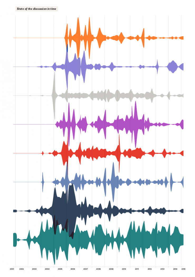
Hi! I’m Martina, a student that has developed her thesis project “Visualizing controversies in Wikipedia” in the Density Design Lab and obtained the master degree in Communication Design at Politecnico di Milano on April 2014. The aim of my research was to analyze “Family Planning” article of the English version of Wikipedia as a case study to understand how controversies on the web develop.

Thanks to its increased popularity and relevance as a new form of knowledge generated by its users, but also to its fully accessible database, Wikipedia has received much attention in the last years from the scientific and academic community. The starting point of my research was thus the collection and the categorization of all the studies which addressed Wikipedia data analysis and visualization. Some researchers investigated pages growth rate, others the motivation and quality of users’ contribution, while others the ways in which users collaborate to build the article contents. A group of the considered studies also focused on conflict and controversy detection in Wikipedia rather than on consensus and agreement.
Nevertheless, among the 37 considered studies, only 9 of them used data visualization as an integrated method to investigate and convey knowledge. The scheme above summarizes these studies grouped by the visualization method they used, highlighting how they call their methods, which part of the Wikipedia page was analyzed and the study aims. Moreover, studies that focused on the same part of Wikipedia’s article are linked together with the same type of line. Do you think that I can add other interesting studies that used data visualization in Wikipedia analysis?
References:
1. [Bao, Hecht, Carton, Quaderi, Horn, Gergle 2012] Omnipedia: bridging the Wikipedia language gap
2. [Brandes, Lerner 2008] Visual analysis of controversy in user-generated encyclopedias
3. [Brandes, Lerner, Kenis, Van Raaij 2009] Network analysis of collaboration structure in Wikipedia
4. [Kittur, Suh, Pendleton, Chi 2007] He says, she says: conflict and coordination in Wikipedia
5. [Laniado, Tasso, Volkovich, Kaltenbrunner 2011] When the wikipedians talk: network and tree structure of Wikipedia discussion pages
6. [Suh, Chi, Pendleton, Kittur 2007] Us vs. them understanding social dynamics in Wikipedia with revert graph visualizations
7. [Viegas, Wattenberg, Dave 2004] Studying cooperation and conflict between authors with history flow visualizations
8. [Viégas, Wattenberg, Kriss, Ham 2007] Talk before you type
9. [Wattemberg, Viégas, Hollenbach 2007] Visualizing activity on Wikipedia with chromograms
Monday, July 7th, 2014
The making of the “Seven days of carsharing” project
This post was originally posted on Visual Loop
As a research lab, we are always committed to exploring new research fields, new data sources and new ways to analyze and visualize complex social, organizational and urban phenomena.
Sometimes it happens that self initiated explorations become small side projects that we develop in our spare time and publish after a while. This is what happened in the past with RAW and other side projects.
In this kind of work we think is important to keep things simple and proceed step by step in order to have flexible and iterative processes and the possibility to experiment new tools and visual models that we can use later.
In this sense in the last months we decided to work on a small project we called “Seven days of carsharing”. The rise and growth of many car sharing services around the world has been an important factor in changing the way people move inside the city.
Visualizing and analyzing data from these services and other forms of urban mobility allows for a better understanding of how the city is used and helps to discover the most prominent mobility patterns.
The website is structured around a series of visual explorations of data collected over the time span of one week from one of the main car sharing services in Milan called Enjoy.
We started this project as a small experiment to investigate through different techniques how urban traffic patterns evolve day by day and the main characteristics of use of the service.
Data Scraping
Since Enjoy doesn’t provide any information about the routing, but just the position of the available cars, one of the biggest technical challenge was to find a way to explore the individual routes.
Inspired by this interesting project by Mappable we decide to process the data using an open routing service (Open Source Routing Machine) to estimate route geometries for each rent. The data has then been translated into a geojson file that we used for two visualizations.
Visualizations
Since the beginning the idea was to combine different kind of visualizations, both geographical and not in order to explore the different dimensions of the phenomenon, the biggest challenge was to combine them in a linear story able to convey some insights about mobility in Milan.
For this reason we decided to build a single page website divided in five sections. Each one enable the user to explore a dimension of the phenomenon and give some interesting insights.
The first visualization, created with d3.js, is the entry point on the topic and it represents an overview of the total number of rents. Every step is a car and every rent is represented by a line that connects the pick-up moment and the drop-off. Consequently, the length of the line represent the duration of time a single car has been rented. In this way it’s possible to discover when the service is most used and how the patterns evolve depending on the day of the week and the hour.

The second section of the website is focused on the visualization of the routes we extracted using the routing service. The routes data has then been visualized with Processing, using the Unfolding library to create a video and Tilemill and Mapbox.js to create the interactive map and the map tiles. Each rent has a start and an end time, and could hence be displayed in its own timeframe. In addition, the position of the car in the path was computed by interpolating its coordinates along the route with respect to the total duration and length of the rent.
The resulting routes represent the most likely way to go from the start point to the end point in the city. Obviously, the main streets (especially the rings of the city), are the most visible. It should be noted that this phenomenon is also the result of the service we used to get the routes that tend to privilege the shortest path instead of the quickest one and it doesn’t take in account other factors like traffic and rush hours.
In the last sections of the website we decided to focus on the availability of cars and their position during the week to understand which areas of the city are more active and when.
In the first visualizations we used a Voronoi diagram buil din D3.js in order to visualize both the position of the cars, represented by yellow dots, and also the area “covered” by each car. The areas surrounding the cars in fact contain all the points on the map closer to that car than to any other.
To better understand the patterns we decided to plot, beside the maps, the number of available cars for each of 88 neighbourhoods of Milan using a streamgraph. The streams show the number of cars available every hour for each neighbourhood, sorted by the total amount of cars available during the whole week.


General Remarks
We really enjoyed working on this project for many reasons.
First of all, working on small and self-initiated side projects like this gives us the opportunity to experiment a wide range of tools, in particular open mapping tools like Tilemill and Unfolding. In this way we could better understand the limits and advantages of different technologies and visual models.
Another important and positive aspect of this project was the possibility to involve different people of our lab, from software engineers to interns, experimenting flexible and agile workflows that allowed us to test multiple options for each visualizations that can be implemented in other projects in the future.
Friday, July 4th, 2014
A preliminary map of the creative professionals at work for EXPO 2015


Over 90% of the world’s population will be represented in Milan in 2015 for the Universal Exhibition. But how many creative professionals all over the world are working with Expo 2015 to give form and content to this event? The answer is many and the number is growing day by day.
The map we created for the exhibition Innesti/Grafting curated by Cino Zucchi and with the visual identity by StudioFM, is intended to provide an initial response, certainly not exhaustive, to this question.
The visualization, that you can find printed on a 6 by 3 meters panel inside the section of the Italian Pavilion dedicated to Milan and the EXPO2015, represents all the architectural and design projects that will be realized for the EXPO2015 and all the creative professionals and countries involved, weighted on their importance and involvement in the project.
The visualization, based on data provide by EXPO2015 S.p.A., has been created with Nodebox3, an open-source tool ideal for rapid data visualization and generative design.
Check out the high resolution version of the visualization here.
Photo’s courtesy of Roberto Galasso.
Tuesday, July 1st, 2014
Seven days of carsharing: exploring and visualizing the Enjoy carsharing service in Milan

As a research lab, we are always committed to exploring new research fields and new data sources.
Sometimes it happens that these self initiated explorations become small side projects that we develop in our spare time and publish after a while. This is what happened in the past with RAW and other side projects. In this kind of work we think is important to keep things simple and proceed step by step in order to have flexible and iterative processes and the possibility to experiment new tools and visual models that we can use later.
The rise and growth of many car sharing services has been an important factor in changing the way people move inside the city.
Visualizing and analyzing data from carsharing services and other forms of urban mobility allows for a better understanding of how the city is used and helps to discover the most prominent mobility patterns.
The website is structures around a series of visual explorations of data collected over the time span of one week from one of the main car sharing services in Milan called Enjoy.
We started this project as a small experiment to investigate through different techniques how urban traffic patterns evolve day by day and the main characteristics of use of the service.
In february 2014 we started scraping data directly from the Enjoy website getting the position of all the cars available every 2 minutes. We collected more than 1,700,000 data points resulting in more than 20,000 rents, and 800 days of usage.
Since the beginning the idea was to combine different kind of visualizations, both geographical and not in order to explore the different dimensions of the phenomenon, the biggest challenge was to combine them in a linear story able to convey some insights about mobility in Milan.
For this reason we decided to build a single page website divided in five sections. Each one enable the user to explore a dimension of the phenomenon and give some interesting insight.
Since Enjoy doesn’t provide any information about the routing, but just the position of the available cars, one of the biggest technical challenge was to find a way to explore the individual routes.
Inspired by this interesting project by Mappable we decide to process the data using an open routing service (Open Source Routing Machine) to estimate route geometries for each rent. The data has then been translated into a geojson file and visualized with Processing, using the Unfolding library, to create a video and with Tilemill and Mapbox.js to create an interactive map.
To see all the visualizations, discover our process and some insights please visit the project here.
Thursday, May 8th, 2014
An interview with Richard Rogers:
repurposing the web for social and cultural research
During my time as a visiting researcher at the University van Amsterdam I had the opportunity to interview Richard Rogers, professor of New Media and Digital Culture. He calls himself a “Web epistemologist”, and since 2007 he’s director of the Digital Methods Initiative, a contribution to doing research into the “natively digital”. Working with web data, they strive to repurpose dominant devices for social research enquiries. He’s also author of the “Digital Methods” book. With him I tried to explore the concept of Digital Methods, and the relationship with design.

Richard Rogers at Internet Festival 2013, photo by Andrea Scarfò
Let’s begin with your main activity, the Digital Methods. What are they, and what are their aims?
The aims of Digital Methods are to learn from and repurpose devices for social and cultural research. It’s important to mention that the term itself is meant to be a counterpoint to another term, “Virtual Methods”. This distinction is elaborated in a small book, “The end of the virtual“.
In this text I tried to make a distinction between “Virtual Methods” and “Digital Methods”, whereby with Virtual Methods, what one is doing is translating existing social science methods — surveys, questionnaires et cetera — and migrating them onto the web. Digital Methods is in some sense the study of methods of the medium, that thrive in the medium.
With virtual methods you’re adjusting in minor but crucial detail existing social science methods whereas digital methods are methods that are written to work online. That is why the term native is used. They run native online.
Are virtual methods still used?
Yes, and virtual methods and digital methods could become conflated in the near future and used interchangeably for the distinction I’m making between two is not necessarily widely shared.
In the UK there is a research program called digital methods as mainstream methodology which tries to move the term outside of a niche. Virtual methods, on the other hand, has been more established, with a large Sage publication edited by Christine Hine.
Digital Methods, the book, was awarded the “2014 Outstanding Book of the Year” by the International Communication Association, which gives it recognition by the field, so now the argument could be in wider circulation.
Today, many websites use the term Digital Methods. I was curious to know if you were the first one using it or not.
Yes, the term originated here, at least for the study of the web. The term itself already existed but I haven’t created a lineage or really looked into it deeply. I coined or re-coined it in 2007.
If you look at digitalmethods.net you can find the original wiki entry which situates digital methods as the study of digital culture that does not lean on the notion of remediation, or merely redoing online what already exists in other media.
How do digital methods work?
There is a process, a procedure that is not so much unlike making a piece of software. Digital Methods really borrows from web software applications and web cultural practices. What you do is create a kind of inventory, or stock-taking, of the digital objects that are available to you: links, tags, Wikipedia edits, timestamps, likes, shares.
You first see what’s available to you, and then you look at how dominant devices use those objects. What is Google doing with hyperlinks? What is Facebook doing with likes? And then you seek to repurpose these methods for social research.
You’re redoing online methods for different purposes to those intended. This is the general Digital Methods protocol.
What is your background, and how did you get the idea of Digital Methods?
My background is originally in political science and international relations. But most of the work behind Digital Methods comes from a later period and that is from the late ’90s, early 2000s when we founded the govcom.org foundation. With it, we made the Issue Crawler and other tools, and a graphical visual language too for issue mapping.
That’s combined in the book, “Preferred placement”, and it includes the first issue map that we made: a map of the GM food debate. You can see link maps and a kind of a visual language that begins to describe what we referred to at the time as the “politics of associations” in linking.

Genetically Modified food debate map (Preferred Placement, 2000)
It began with a group of people working in the media and design fellowship at the Jan Van Eyck Academy in Maastricht, but it also came out of some previous work that I had done at the Royal college of Art, in computer related design.
Those early works were based on manual work as well. Our very first map was on a blackboard with colored chalk, manually mapping out links between websites. There’s a picture somewhere of that very first map.
So, you created the first map without any software?
Yes. And then we made the Issue Crawler, which was first called the “De-pluralizing engine”.
It was a commentary on the web as a debate space, back in the ‘90s when the web was young. New, pluralistic politics were projected onto the web, but with the De-pluralizing Engine we wanted to show hierarchies where some websites received more links than others.
Issue Crawler first come online in a sort of vanilla version in 2001 and the designed version in 2004. The work comes from my “science and technologies studies” background and in part scientometrics, and citation analysis.
That area, in some sense, informed the study of links. In citation analysis you study which article references other articles. Similarly, with link analysis you’re studying which other websites are linked to.

Nanotechnology policy map, made with Issue Crawler
Reading your book (Digital Methods), sometimes the research is on the medium and some others studies are through it.
Indeed, Digital Methods do both kinds of research, it is true. There’s research into online culture and culture via online data. It’s often the case that we try to do one or the other, but mainly we simultaneously do both.
With Digital Methods one of the key points is that you cannot take the content out of the medium, and merely analyze the content. You have to analyze the medium together with the content. It’s crucial to realize that there are medium effects, when striving to do any kind of social and cultural research project with web data.
You need to know what a device artifact is, which search results are ‘Google artifacts,’ for example. We would like to undertake research, as the industry term would call it, with organic results, so as to study societal dynamics. But there’s nothing organic about engine results.
And the question is, how do you deal with it? How explicit do you make it? So we try to make it explicit.
I think the goal has always been trying to do social research with web data, but indeed we do both and we also strive to discuss when a project is aligning with one type of research or to the other.

Digital Methods (2013), by Richard Rogers.
On the web, the medium is changing very quickly. Does this affect your research? Is it a problem?
Well it’s something we addressed from the beginning, because one of the prescripts of Digital Methods, one of the slogans, has been to follow the medium, and the reason is that the medium changes. You cannot expect doing sort of standard longitudinal research.
You do not receive the same output out of Facebook nowadays that you had three years ago, or five years ago. The output changed. You can go back in time and harvest Facebook data from five years ago, but Facebook was in many respects a different platform. There was no like button. Similarly, you need to know something about when Google performed a major algorithm update, in order to be able to compare engine results over time.
We are working with what some people call “unstable media”. We embrace that and of course there have been times when our research projects become interrupted or affected by changes in the advanced search, for example in a project created by govcom.org, called “elFriendo”. It is an interesting piece of software where you can use MySpace to do a number of things: create a new profile from scratch, check the compatibility of interests and users, and do a profile makeover.
And this worked very well until MySpace eliminated an advance search feature. You can no longer search for other users with an interest. So that project ended but nevertheless it remains a conceptual contribution, which we refer to as an approach to the study social media called post-demographics. This means that you study profiles and interests as opposed to people’s ego or social networks. This project opened up a particular digital methods approach to social media.
Presenting diagrams made by DMI or based on your methods, sometimes I encounter skepticism. Most of the statements are: you cannot prove that web represents society / when looking at people, you cannot define which portion of the population you are following / when crawling websites, you don’t know what kind of information is missing. Do you receive critiques on DM reliability? How do you answer these?
There is lot of scepticism toward research that has to do with online culture.
Normally it’s thought that if you’re studying the web you’re studying online culture, but we are trying to do more than that.
A second criticism or concern is that online data is messy, unstructured, incomplete, and it doesn’t really meet the characteristics of good data.
And then the third critique is that even if you make findings with online data you need to ground these findings in the offline, to make them stronger. Working with online data, Digital Methods necessarily needs to be part of a mixed methods approach. This is the larger critique.
How do I answer to these critiques? Well I agree with the spirit of them, but the question that I would like to pose in return is: how do we do Internet research?
One could argue that what you sketched out as critiques apply more to Virtual Methods than to Digital Methods. Because the various expectations to be met, those are the expectations that Virtual Methods are trying to deal with; while Digital Methods is a rather different approach from the start.
We use the web in a kind of opportunistic manner for research. Given what’s there, what can we do? That’s the starting point of Digital Methods.
The starting point is not how do we make a statistical sample of parties to a public debate online. That would be a Virtual Methods concern.
One common word used today is Digital Humanities. Are Digital Methods part of it?
To me, Digital Humanities largely work with digitized materials, while Digital Methods work with natively digital data. And Digital Humanities often use standard computational methods, while Digital Methods may come from computational methods but are written for the web and digital culture.
So the difference between Digital Methods and Digital Humanities is that the latter work with digitized material using standard computational methods.
What’s the difference in using a digitized archive (e.g. digitized letters from 1700) and an archive of born-digital data?
If you work with the web, archiving is different, in the sense that the web is no longer live yet is digital, or what Niels Bruegger calls re-born digital.
So web archives are peculiar in that sense. We could talk more specifically about individual web archives.
Let’s talk about the Wayback Machine and the Internet Archive, for example, which I wrote about in the “Digital Methods” book. It was built in 1996 and reflects its time period, in that it has a kind of surfing mentality built into it as opposed to searching.

Apparently, in 2010 there was nothing of interesting to record on our website.
It’s also a web-native archive, and is quite different from the national libraries web archives: they take the web and put it offline. If you want to explore them, you have to go to the library; they’ve been turned into a sort of institutionalized archive, one in the realm of the library and librarians.
So it is a very different project from the Internet Archive. You can tell that one is far webbier than the other, right?
Another widely used word is big data. Sometimes it is used as synonym for web data. Is it something related to what you do or not?
As you know, I’m one of the editors of the “Big Data & Society” journal, so I’m familiar with the discourse.
Digital methods are not necessarily born in that; they are an approach to social research with web data, so the question is, what’s the size of that web data? Can digital methods handle it?
Increasingly we have to face larger amounts of data. How would one start to think the work is big data? Is it when you need clusters and cloud services? I think when you reach those two thresholds you’re in the realm of big data and we’re nearly there.
The final chapter of my book deals with this, and I think it is important to consider what kind of analysis one does with big data.
Generally speaking, big data call for pattern seeking, so you have a particular type of analytical paradigm, which then precludes a lot of other interpretative ones which are finer grained and close-reading.
Digital Methods are neither only distant reading nor close reading, but can be either. So Digital Methods do not preclude the opportunities associated with big data but they certainly are not dealing exclusively with big data ones.
You created a considerable amount of tools. Some of them are meant to collect data, others contain a visual layer, and some other ones are meant for visualization. How much importance do you give the visual layer in your research? How do you use it?
Our flagship tool, the Issue Crawler, and a lot of subsequent Digital Methods tools, did a number of things. The idea from the beginning was that the tool would ideally collect, analyze and visualize data. Each tool would have a specific method, and a specific narrative, for the output.
The purpose of digital methods tools would not be generic, rather would be specific or in fact, situated, for a particular research. Most of the tools come from actual research projects: tools are made in order to perform a particular piece of research, and not to do research in general. We don’t build tools without a specific purpose.

Analysing links in a network, navigating Amazon's recommendation networks, scraping Google: here you can find all the tools you need.
The second answer is that designers have always been important; the work that I mentioned comes from a sort of confluence on one hand on science studies and citation analysis, and on the other hand computer-related design.
I was teaching in science studies at the University of Amsterdam and in computer related design at the Royal College of Art, specifically on mapping, and a number of projects resulted from my course, for example theyrule.net.
My research always had a political attitude as well: with analytical techniques and design techniques we’re mapping social issues.
And we map social issues not only for the academia, our audience also has been issue professionals, people working in issue areas, and in need of maps, graphical artifacts to show and tell before their various issue publics and issue audiences. We’ve always been in the issue communication business as well.
For which public are the visualizations you produce meant?
We have a series of publics: academics, issue professionals, issue advocates, activists, journalists, broadly speaking, and artists. It isn’t necessarily a corporate audience.
Each of those audiences of course has very different cultures, communication styles and needs.
So we try to make tools that are quite straightforward and simple, with simple input and simple output. That’s really the case for the Lippmannian device, also known as Google Scraper, where there are few input fields and you get a single output.
It’s also important for us to try to reduce the threshold in the use. For the Issue Crawler there are 9000 registered users. Obviously they don’t use it all the time.
Generally speaking the tools are open to use, and that’s also part of the design.
In the last summer schools you invited some former DensityDesign students.
Were you already used to invite designers?
Yes, govcom.org as well as DMI has always been a collaboration, maybe I should have mentioned this from the beginning, between analysts, programmers, and designers. And then sometimes there is more of one than another, but we always created a communication culture where the disciplines can talk each other.
Often times the problem, when working in an interdisciplinary project, is that people don’t speak each other’s language. What we’re trying to do is to create a culture where you learn to speak the other’s language. So if you encounter a programmer and say ‘this software is not working’, he would probably ask you to ‘define not working’.
Similarly you won’t go to a designer and just talk about colors, you need a more holistic understanding of design.
It is a research space where the various kinds of professions learn to talk about each other’s practice. It’s something that people in Digital Methods are encouraged to embrace. That’s has always been the culture here.

DensityDesign students during the 2012 summer school: "Reality mining, and the limits of digital methods". Photo by Anne Helmond
You’ve lots of contacts with design universities. Why did you invite designers from DensityDesign?
Well, because Milan students are already trained in Digital Methods, and I didn’t know that until someone showed me the work by some of you in Milan, using our tools, doing something that we also do, but differently.
What we found so rewarding in Milan is the emphasis on visualizing the research process and the research protocols.
If you look at some of our earlier work, it’s precisely something we would do (for example in “Leaky Content: An Approach to Show Blocked Content on Unblocked Sites in Pakistan – The Baloch Case” (2006)). It is an example of Internet censorship research.
And from the research question you show step by step how you do this particular piece of work, to find out if websites telling a different version of events from the official one are all blocked. So when I saw that DensityDesign was largely doing what we have always naturally done but didn’t really spell it out in design, I thought it was a great fit.
Is there design literature on Digital Methods?
Our work is included, for example, in Manuel Lima visual complexity, and earlier than that our work has been taken up in Janet Abram’s book on Elsewhere: Mapping. She’s also a curator and design thinker I worked with previously at the Netherlands Design Institute, which no longer exists; it was a think-and-do-thank run by John Thackara, a leading design thinker.
In some sense the work that we’ve done has been a part of the design landscape for quite some time, but more peripherally. We can say that our work is not cited in the design discourse, but is occasionally included.
IDEO, a famous design firm, published a job opportunity called “Design Researcher, Digital Methods”. This is an example of how Digital Methods are becoming relevant for design. Is their definition coherent with your idea?
No, but that’s ok. It coheres with a new MA program in Milan, which grew out of digital online ethnography.
Digital Methods in Amsterdam has had little to do with online ethnography, so this idea of online ethnography doesn’t really match with Digital Methods here, but does match with DM done there and elsewhere. Online ethnography comes more from this (showing Virtual Methods book).
IDEO’s job description is not fully incompatible but it’s more a collection of online work that in fact digital agencies do. This particular job description would be for people to build tools, expertises and capacities that will be sold to digital agencies. So these are core competencies for working with online materials.
Is it surprising for you that this job offer uses the term ‘Digital Methods’?
The first thing you learn in science studies is that terms are often appropriated.
How I mean Digital Methods isn’t necessarily how other people would use it, and this appropriation is something that should be welcomed, because when people look up what Digital Methods are, where they came from, when they discover this particular school of thought, hopefully they’ll get something out of the groundwork we’ve done here.
We worked together during the EMAPS project. How do you evaluate DensityDesign approach?
I think that DensityDesign contribution to EMAPS has been spectacular.
Generally speaking I don’t have criticisms of the DensityDesign contribution, but I have questions and they have to do maybe more generally with design thinking and design research.
Often times design think from the format first. Often design starts with a project brief, and with it there is already a choice for a format of the output, because you need to have constraints, otherwise people could do anything, and comparison would be difficult. It’s indeed the element of the project brief that we do differently. So maybe it’s worth to document the differences.
The Digital Methods approach, in terms of working practice, relies on the current analytical needs of subjects matter experts, whereby those needs in some sense drive the project.
Working with web data, the standard questions that we ask a subject matter expert is “what’s the state of the art of your field? What are you analytical needs? And what do you think Internet could add?”
We let the subject matter expert guide our initial activities, provide the constraints. That’s the brief. Which is a different way of working from the idea that, for example, this project output will be a video.
Another comment I would add is the more Digital Methods have become attuned to the field of information visualization, the more DM has learnt from this field, the more standardized the visualizations have become. Whereas in the past we were wild, and we made things that did not necessarily fit the standards.
One of the questions that have been asked in a project I’m working on is: “are good big data visualization possible?” But similarly one could ask: “in data visualization, is innovation possible?” Because what we’re currently seeing is increasing standardization.
So then, what is innovation in data visualization? These are the questions I would pose across the board.
Because when designers are working with project partners, I think they learn more about the analysis than about data visualization.
So is imagination now driven by data analysis? The challenge is to think about processes or setups which make possible innovation.
- Make 5 Sentences about Saying Disagreement
- Payment Agreement Sample Philippines
- Can Landlord Charge for New Tenancy Agreement
- Spirit Airlines Tax Receivable Agreement
- Ancillary Services Agreement
- Download Agreement by Shanko Rasheed
- Facebook User Agreement Photos
- Music Production Contracts Templates
- Do Contractors Do Financing
- Free Trade Agreement Russia
- Stock Purchase Agreement Good or Bad
- Terminating Employee Contract Early
- It Support Agreements
- Iran Nuclear Agreement Terms
- Rental Lease Agreement for Ct
- Tcode for Display Contract Status
- Contracts Manager Jobs in Bangalore
- Behavioral Health Contractors Association
- User Agreement in Arabic
- Rcuh Agreement for Services