Blog
Wednesday, September 7th, 2022
Recap of the “Gephi Week” at SciencePo: inquiring the community detection algorithm of Gephi

The CNRS, the Gephi Consortium and the University of Aalborg organized a one-week datathon in Paris, in collaboration with the médialab at the SciencePo. Along with volunteers from the community that maintains Gephi, the open source software used to visualize networks, we participated to identify ways to improve some aspects of the tool.
More in detail, we focused specifically on the modularity algorithm, which allows to identify communities of nodes inside a network that share connections between one another. The algorithm is widely used by the community that uses Gephi, as it lets perform visual network analysis quite easily.
Developers and researchers that use and develop the platform, however recognize some weaknesses in how the algorithm is used: currently, the modularity class algorithm returns clear cut communities, while in reality many areas of the network may be ambiguous. Since the algorithm is non-deterministic (meaning that each run may return slightly different results), not all nodes in a network may always belong to the same community.
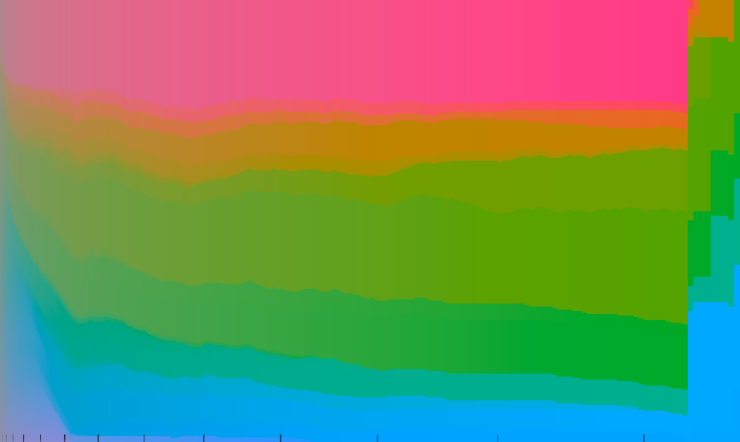
In the example above, ten different runs of the algorithm on the same network return different results. In the current implementation of the algorithms, however, the user is not encouraged to run it multiple times to compare the results, especially if they don’t have a previous understanding of how it works.
By discussing during the workshop, two concerns (at least), emerged:
- How to visualize the modularity itself?
- How to make the multiplicity visible to the user who would otherwise run the modularity clustering just once?
These two questions open up a field of explorations that try to address the ambiguity in the results of the algorithm, making it a feature of the visualization methods.
Indeed, we present two explorations developed during the week in collaboration with the community of Gephi.
Visualizing the modularity algorithm
Observable Notebook developed by Mathieu Jacomy, Andrea Benedetti and Tommaso Elli
The first exploration focused on visualizing the algorithm itself, in an effort to involve the user in the process that it follows to group nodes into larger and larger communities. The algorithm works iteratively, meaning that at each iteration it tries to group a node to its neighbours recursively. At the beginning, each node belongs to its own community, and it ends with an overall number of communities that is related to the “Resolution” parameter of the algorithm.
To visualize the algorithmic process, we used the color space to map communities and their evolution. Using the CIELAB color space, we assigned a color hue to each node, sampling the hue circle. Each iteration, the color is increasingly more vivid, starting from grey and reaching full chroma in an effort to represent the certainty of these communities after each iteration.

The data was constructed to have a list of communities detected and their relative population in each iteration. This let us experiment with various visualization techniques that did not directly reference the topology of the network, rather that abstracted it into a two dimensional visualization. The visualization is split into a grid, where horizontal lines represent communities and their height the population, while vertical slices represent iterations of the algorithm.
The visualization allowed us to have an insight of how the algorithm works, tracking the evolution of its results. The visualization sparked an interesting discussion on how the major groupings that depend on the Resolution parameter happen all at once at the end of the iterations. Additionally, the color space slicing could be used to represent the evolution of the algorithm directly on the network, tying back the visualization to its topology.
Modularity classes fluctuations
Observable Notebook developed by Tommaso Elli, Andrea Benedetti, Côme Brocas, Axel Meunier
The second exploration dealt with the non-deterministic nature of the algorithm, and how data visualization could help in showing the ambiguous nature of specific nodes in the network.
In this exploration, the data was handcrafted by the team by running the modularity class ten times on a network that has three stable areas, and a central where nodes have a high chance of falling into one of the three main communities interchangeably. We then visually retrace different classes to have consistent names in each run. This was done qualitatively, looking at ten images generated with Gephi, and by discussing with the developers attending the workshop it emerged as one of the most challenging aspects to implement computationally in Gephi.
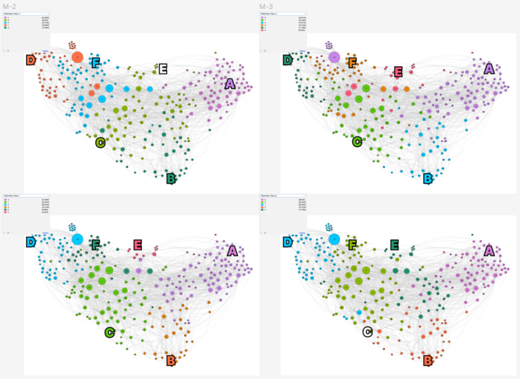
After these first steps, we had 10 classes for each node. We computed three simple additional values (that could be replaced with more sophisticated calculations):
- Hesitancy metric, which counts how many times a node switches classes;
- Mode value, which stores the most occurrent class for each node;
- Mode intensity, which calculates how many times the mode class appears (in percentage).
Using these three metrics, we were able to explore visually how we could represent this kind of information. We explored mapping these metrics with various visual variables: saturation, opacity, intensity of color etc.
These experiments raised many interesting discussions on the feasibility of the method. In the contained context of the workshop, many of the experiments were weighted with pros and cons on their effectiveness.
Wrap up
The week was streamed on Twitch on datalgo’s page, you can catch up to the final presentations on the recorded streaming where all the other results of the week were discussed.
Monday, July 18th, 2022
Suggested reading: Hallnäs, L., & Redström, J. (2002). From use to presence: On the expressions and aesthetics of everyday computational things.
When investigating how we frame technology in the design process, and specifically technology that produces data, I found this publication by Lars Hallnäs and Johan Redström, published in 2003 in the journal “ACM Transactions on Computer-Human Interaction”. The article raises a few key points that are instrumental to research the role we, as researchers and designers, have in introducing new technologies to the general public.
In particular, the authors highlight the complementarity between “use” and “presence” of technological objects, and how we have extensive methods and techniques to evaluate “use” but not enough to evaluate “presence” of technological artefacts.
In interaction design for computer systems, use is traditionally in focus when determining design variables and their instantiation. We seek a solution that satisfies the basic criteria for usability such as efficiency in use, low error rate, and support for recovery from error, based on a general knowledge about what to do and what not to do to meet such criteria. […] If we instead turn to artifacts as they are defined in terms of their place and role in everyday life—an existential definition—the situation is quite different. There is no longer a well-defined general notion of use that will cover all these different definitions in sufficiently many nontrivial cases.
The set of descriptors (or adjectives) that we use to describe technology frames it in a way that well functioning designs and products perhaps avoid discourse on their role as part of our everyday life and, from a larger point of view, as part of society.
That people sit down in the chair belongs to the expression of the chair, but the users disappear as we refrain from referring to why they sit down and what they are doing sitting in the chair.
The authors argue that a big part of how to design for presence rests on “aesthetics”, and how aesthetics become an integral part of the identity of design objects. Aesthetics is closely related to the concepts of “space” and “time”: interaction with design objects may be ephemeral, but their “dwelling” (or their peripheral persistence) may last years.
Hallnäs and Redström adopt a Critical Design standpoint to construct a framing that brings “presence” into the center of the design activity. As a speculative exercise, they try to reframe a “phone” as an conceptual artefact that focuses on atomical expressions of its uses:
To do this, we consider its expressions [the phone’s, nda] in various elementary acts of phoning, such as the following: writing, listening, talking, sending, being open for communication, being connected, waiting, communicating etc. […] However, thinking about how a mobile phone expresses itself in acts of waiting, listening, talking, etc., is clearly different from thinking about what we use it for. […] What does, for instance, “waiting” mean in the design of a phone?
Framing computational objects with this point of view opens up discussion and reflection on how we, as designers, construct narratives and metaphors to make technology understandable (or not) in design products.
Enlarging the scope of presence to “data” as a design artifact
This stance on technology and computational objects mainly refers to the field of Human-Computer Interaction, the ontological meaning of this interaction and its implications. However, it could be expanded to designing with data as well: specifically, “designing for presence” could be a meaningful exercise in evaluating and pondering how technology can be used to capture user’s data without their full awareness from a designer’s standpoint.
What would it mean to design the “presence” of personal data? What are the possible expressions and aesthetics that convey their identity? In this space, communication design can play a pivotal role in exploring how aesthetics and expression of data can convey their presence in either everyday life or society.
Tuesday, January 11th, 2022
DensityDesign Open Presentations 2022

We are happy to invite you to the Open Presentations of the Final Synthesis Design Studio at Politecnico di Milano, “Mediazioni Algoritmiche. Designing in a data-intensive society”.
On the 20th of January students from Politecnico di Milano – Design School will present their projects on various topics investigating the relationship between society and everyday technologies.
You can follow the presentations online at this link or join us in presence by registering to this event (counted seats, the event could be deleted due to covid conditions) on Eventbrite.
The Open Presentations will close with the opening of the exhibition of all group projects, along with the exhibition of Infopoems: a collection of design artefacts with a “poetic” approach to data, which reconciles the description of a phenomenon with the experience we have about it.
Below the event programme (GMT+1 timezone):
- 10:00 Welcome and introduction
- 10:20 “Hype/Technology” panel: what is the blockchain and how are its environmental issues tackled by the companies? What is the new art market of NFTs enabled by the blockchain?
- 11:20 Break
- 11:40 “Platforms/users” panel: how deep is the “infodemic” rabbit hole in radicalized dark platforms? What’s the ecosystem of self-proclaimed alternative apps on digital stores? How do streaming companies fight to keep you on their platforms?
- 13:10 Break
- 14:30 “Material/digital” panel: how is the society of the future of cities like Milan portrayed in architectural renderings? What is the “new materiality” of objects that COVID generated on Amazon? How did COVID generate discourse through online petitions on change.org?
- 16:00 Break
- 16:20 Opening of the exhibition
The Open Presentations will be held:
Politecnico di Milano Campus Bovisa
Via Durando 10, 20158 Milano
Building B2, class B2.1.5
RSVP through Eventbrite to participate in person (limited seats): https://www.eventbrite.it/e/open-day-densitydesign-final-synthesis-design-studio-tickets-227614179137
Or online at:
https://politecnicomilano.webex.com/meet/michele.mauri
Tuesday, March 17th, 2020
Generative×Data-driven Posters
Workshop by OPENRNDR × Politecnico di Milano
This year, we had the pleasure to organise a week-long Workshop with RNDR co-founder Edwin Jakobs, also the creator of OPENRNDR, an “open-source framework for creative coders”. The workshop, held from Feb 17th to Feb 21st, introduced the basics of creative coding and OPENRNDR to our Final Synthesis Design Studio students and challenged them to create a generative and data-driven poster.
The goal of the workshop was to introduce designers with creative coding and the idea of using coding as material for personal and creative expression.
The workshop was organised with frontal lessons in the first two days, to introduce some technical aspects of the framework, and group work for the rest of the week. The teamwork was focused on data scraping from online sources like Google News and DuckDuckGo, then the collected data were used to generate 20 different posters on a topic relevant to the group. The 20 posters, instead of being produced ad-hoc with traditional graphic software, would have been generated randomly by a coded set of rules and data sources without being retouched by hand.
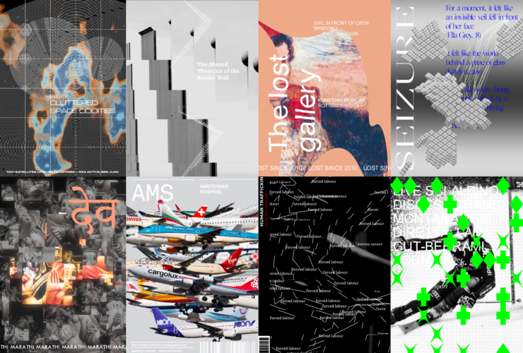
The results are 8 sets of 20 posters depicting various topics, from the more niche like “airplane spotting”, to the more politically engaged like “human trafficking”.
Space Oddities
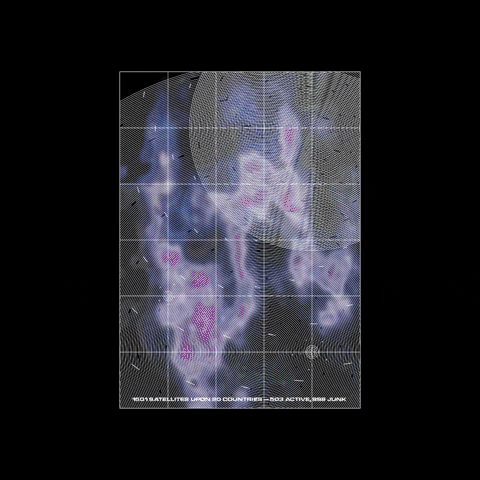
Since 1957, more than 6000 satellites have been launched into space. They are like oddity invaders into the peaceful outer space, becoming debris while serving human purposes. Group 1 goal is to make people aware of this and to show it to those who cannot see it in daily life.
Border Friction
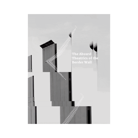
Borders encapsulate the leading worldwide challenges of democracy and humanity. Group 2 wants to graphically convey the perception of separation through posters based on border-related Google news, to communicate the ever-going disputes and distress related to borders.
The Lost Gallery
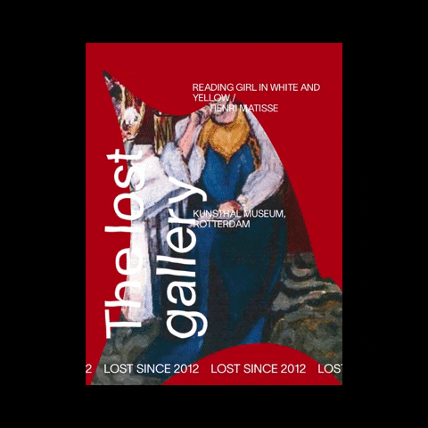
Art theft is usually done for resale or for ransom, but only a small percentage of stolen art is recovered. Group 3 with these posters wants to convey how stolen artworks can become just memories when they are never uncovered and how this phenomenon results in a loss of culture.
Seizures
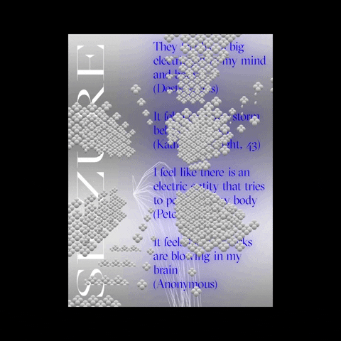
Around 50 million people are suffering from epilepsy. Still, this neurological disease is not fully understood due to the inexplicability of its manifestations. Group 4 project aims to explain what epilepsy is by highlighting the words and symptoms of people who live this pathology.
Perceptions of God
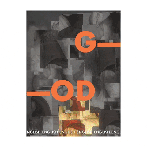
Group 5 explored the boundaries between languages and ideas, by examining and visualizing the word/idea of “God” and how it is portrayed in 20 different languages. The aim is to show how every culture is diversified by different entities and how the concept of supreme power transcends language barriers.
Airplane Spotting
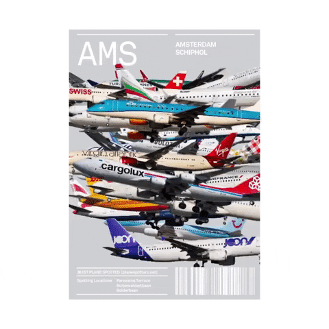
Airplane spotting is like bird watching in the modern age. It’s often seen as an obsessive collection in a digital environment. Group 6 aims to visualize data crowds of airplane spotting images of five different airports and their relative air traffic.
Human Trafficking
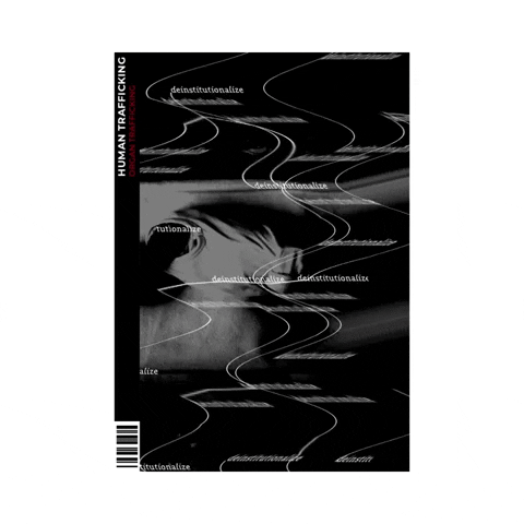
Human trafficking happens every day, in all its different types: sex, labour and organ trafficking. Group 7’s project wants to transmit the different emotions the victims encounter with different graphic notations: e.g. sharp lines representing the constant violence or organic lines representing the dynamic nature of the human body.
Poetic Justice
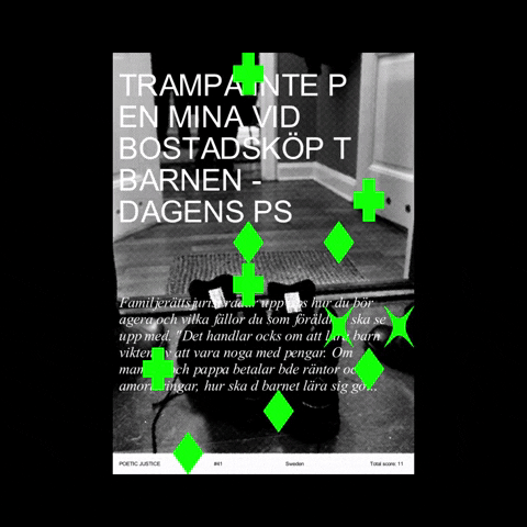
Group 8 shows the reduction of freedom of the press in different nations from all over the world. Headlines, sentences and images from articles were extracted and covered by a generative pattern, with shapes that refer to economic, political and legal scores of the countries.
Friday, January 24th, 2020
DMI Winter School 2020. Post-API Research? On the contemporary study of social media data

DensityDesign Research Lab took part in the Digital Methods Initiative (DMI) Winter School, held in Amsterdam from the 13th until the 18th of January. DMI holds annual Summer Schools and Winter Schools, where designers and students from DensityDesign participate as facilitators.
DMI is an Internet Studies research group directed by Richard Rogers, where new media researchers design methods and tools for repurposing online devices and platforms for research into social and political issues.
This year’s Winter School topic was “Post-API research? On the contemporary study of social media data.” Specific research questions guided each project that might evolve and vary during the week. Using tools from DMI, designers and tecno-anthropologists co-operated to create issue maps and visualizations that aid social research.
Here you can read the full reports!
Haters gonna hate: Dissecting hate speech on social media
Visualisations by Noemi Schiavi
Presentation here
The official definition of hate speech does not consider the linguistic dimension, as the public incitement to violence or hatred might be performed with various linguistic degrees. Haters gonna hate wanted to find a measure to implicit hate speech using a multilingual approach.

This visualisation shows the most recurring offensive words from messages in right-wing Telegram channels.
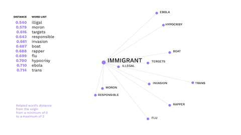
This is an example of how non-hateful words might trigger hate speech.
The word immigrant is not offensive, but gets a negative connotation in the alt-right ideology, evoking offensive words.

Amazon Tracking Exposed
Visualisations by Beatrice Gobbo and Matteo Bettini
Presentation here
How can Amazon personalisation algorithm be understood and what data does it take into consideration? The research was approached with different perspectives, investigating whether online shopping is affected by the users’ wealth and gender.
Apps and Their Practices
Visualisations by Gabriele Colombo, Carlo de Gaetano and Jacopo Poletto
Presentation here
Considering the web as informational space, social media as a space for user-generated content and connectedness, what type of space is the app space? This project tried to answer this question by researching in two different ways. One part of the team focused its research on the differences and similarities of beautification apps and what kind of body enhancements they offer. The other one focused on whether is possible to know how users’ data get from the device sensors to third parties APIs.
This visualisation highlights the different kinds of body modifications addressed by beautification apps in Brazil, in India and in the USA: in the USA and Brazil beautification apps are mainly focused on women bodies, whereas in India, they are more focused on men bodies.
(By Jacopo Poletto) For most of the apps, the connection between the sensors that collect users’ data, and third parties APIs gets lost. The only device where is possible to track down this path is Fitbit.
Who is /ourguy/?
Presentation here
Users on websites like 4chan, Tumblr, and Reddit mostly find social cohesion through cultural bonding. Cultural objects like mascots and memes come to the fore that function as collective masks. But what about the collective face? How does the practice of reflecting on public figures work as a means for collective identity formation within pseudonymous & anonymous Internet subcultures? Four teams tried to answer this question from different perspectives. Following are shown the results from two of them.
Who, dare I ask, is /ourguy/?
Visualisations by Matteo Banal
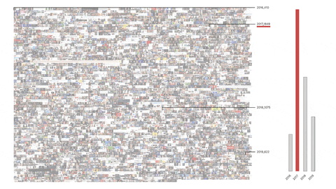
Considering /ourguy/ as a genre of discourse it involves text, images and discussion. This part of the research focused on studying images, which figures and personalities recurred over time, and whether there were any identifiable image practices that could be discerned.
Colouring-in blank canvases
Visualisations by Giovanni Lombardi and Alessandra Facchin
Taylor Swift and PewDiePie were widely perceived unpolitical/apolitical before a specific turning point at which politicisation occurred either by chance or by choice. Both have a longitudinal presence across 4chan, Tumblr, and Reddit and both are available for multiple repurposing opportunities by groups which are forming collective political identities, making it possible to have a cross-platform approach to the research.
Conspiracy Creation Techniques
Visualisations by Guilherme Appolinário and Andrea Benedetti
Presentation here
How do conspiracy theories develop online, on platforms like Reddit and 4chan? Is there a pattern they follow? Starting from preliminary findings, this project analysed two cases of conspiracy theories to see how they evolved through time using the specific vernacular affordances of 4chan and Reddit.
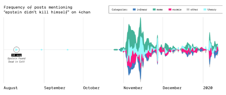
Epstein didn’t kill himself
How, when, and where did the Epstein suicide conspiracy theory transform into a memetic phrase that was popularized outside of online conspiracy culture? Starting as a true conspiracy theory, the phrase “Epstein didn’t kill himself” became more of a meme than a true statement believed by users online and “IRL”. This shift in narrative is highlighted on Reddit and 4chan.
(by Guilherme Appolinário) The queries “Epstein” and “Epstein didn’t kill himself” are searched on Reddit and 4chan, so that the quantity of post mentioning them is compared, highlighting that in November EDKH became a memetic phrase on these two
The Birth of Q-Anon
In 2017, the mysterious user “Q” left a message on /pol/, the “politically incorrect” board on 4chan, where alt-right supported usually gather to share content. Soon after, a series of these messages that seemingly hinted at a broader conspiracy (named “breadcrumbs”) appeared using the same vernacular language of the original post by “Q”.
With the specificity of affordances in 4chan, the research focused on how disseminating information (breadcrumbs left by Q) is handled by the ephemerality of the platform, identifying a network of citations and a continuous black-boxing of these breadcrumbs inside other posts.
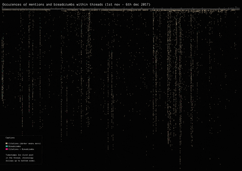
(by Guilherme Appolinário) Breadcrumbs (in red) were left by Q in various threads on /pol/ in month following the appearance of the first breadcrumb. The opening post (“OP”, the first row of the visualisation) of each thread usually cited a previous breadcrumb (in taupe).
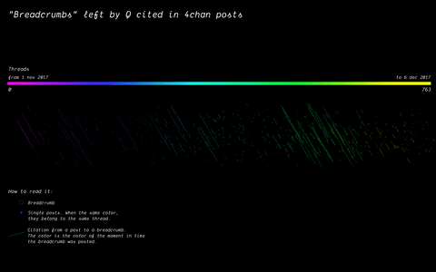
(by Andrea Benedetti) Building on top of the previous visualisation, the actual connections between the breadcrumbs were drawn in the second visualisation. These connections show how far back in time these citations span.
Analysing Neo-Nationalism movements across language communities in Europe
Visualisations by Cristina Pita da Veiga
Presentation here
This research wanted to identify concepts and entities specific to particular language communities that are relevant in the context of Neo-Nationalism. Can such concepts and entities be identified automatically? How similar are right-wing elements in different languages and cultures? This was done by using Event Knowledge Maps.

Newswork on Wikipedia
Visualisations by Antonella Autuori and Federica Bardelli
Presentation here
How does newswork on Wikipedia evolve over time? To what extent does the evolution of news differ across Wikipedia language versions? A Wikipedia back-end research of “Arab Spring” and “European Refugee Crisis” across 10 different time points of references, images, visualization and linguistic terms was conducted in this project.

Wednesday, May 8th, 2019
Mapping and representing informal transport: the state of the art
This research is a preliminary step for an upcoming project. Its focus is to describe the state of the art of Informal Transport Mapping in Sub-Saharan Africa.
Informal Transports are defined, by literature, as:
“Paratransit-type services provided without official sanction.”
R. Cervero, A. Golub, Informal Transport: A global perspective
In most of the sub-Saharan African cities, where this kind of service exists, there isn’t an official mapping of the buses lines and stops. However, there are few projects where communities of users or researchers tried to map Informal Transports within a city.
To find these examples, we started using “Informal Transport Mapping” as query for a Google search and then focusing only on visual representations, such as transit maps. One of the results is the following.
This map shows all the local names that informal transports have in African countries. We reframed the Google query combining each local name with “mapping.” This led us to grassroots projects, initiated by informal transports users or local communities in need of proper information on this kind of services.
The following are some examples of visual maps found, other projects can be found here.
Digital Matatus
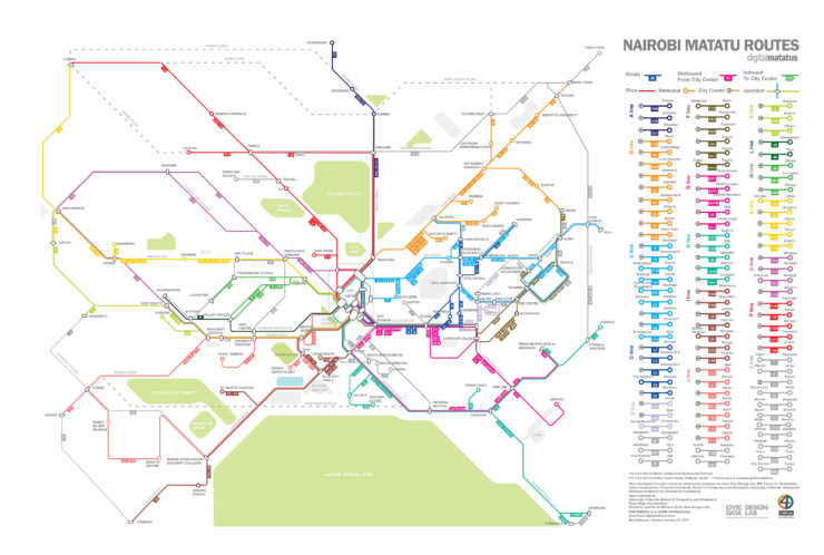
Authors: Columbia University, MIT, University of Nairobi, Groupshot
Location: Nairobi, Kenya
Year: 2012
Status: Ongoing
Map Type: Topological
Format: PDF
Project Description
Digital Matatus is a collaboration between Kenyan and American universities. The project takes advantage of mobile phone technology to collect data about Matatus infrastructures.
Students from Nairobi University collected data about routes by using a GPS app, then stops were identified thanks to students and commuters experience and thanks to visual notation, such as signs.
The data needed to be cleaned and formatted into GTFS, this led to the creation of a new and more flexible GTFS standard for paratransit transports since calendars, timetables and fares are not available for Matatus. Google agreed to update the GTFS file format in use and implemented the data collected during this project as a test to display informal transports on Google Maps.
Map Description
Digital Matatus map is a topological map which wants to show a schematic diagram of Matatus routes. The routes are grouped in coloured lines according to their destination. Landmarks and significative points of Nairobi are highlighted on the map. The map is combined with a list of all Matatu stations and every Matatu line that stops in a specific station.
The map is only available for print, but web and app versions are being developed.
Minibus taxi Routes
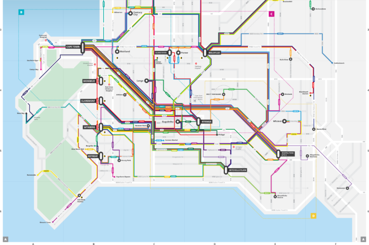
Authors: WhereIsMyTransport
Location: Cape Town, South Africa
Year: 2017
Status: Completed
Map Type: Topological, Thematic
Format: PDF, Web
Project Description
WhereIsMyTransport is a South African public transport data and technology startup. In 2017 they launched Cape Town Taxi Project: in three weeks they collected data about every route, common stopping point, frequencies and fares of minibusses with their own technology.
By integrating formal transport data with informal transport data, WhereIsMyTransport aims to map all the transit infrastructures of Cape Town. All the data are available from their own API for everyone to implement transport app or to design maps.
WhereIsMyTransport designed a printable map with the data collected.
Map Description
The WhereIsMyTransport printable map is a topological map which shows a schematic diagram of Minibusses routes and stops combined with formal transports stops. Each route has a number and a colour, but this marker is not used in the actual transport network. It’s not clear if lines with the same colour are related somehow. The map is divided into four tables. Table A shows the most active minibus routes, tables B C D show minibus routes of different areas.
WhereIsMyTransport API shows formal and informal transports stops on a map provided by Mapbox. All the other data are available as JSON file.
The Bus Map Project
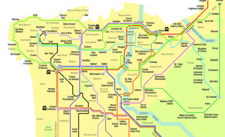
Authors: Chadi Faraj, Jad Baaklini
Location: Beirut, Lebanon
Year: 2015
Status: Ongoing
Map Type: Topological, Thematic
Format: PDF, Web
Project Description
The Bus Map project is a grassroots initiative, started by Chadi Faraj and Jad Baaklini, which aims to map Lebanon formal and informal transport infrastructures. The data used to design the map were collected by ordinary citizens: the ultimate aim of this project is to create a community around the idea of collective mapping. This community should be able to keep the map up to date and to involve more and more people in this activity.
To collect the data app like Open GPS, Gaia GPS and Trails were employed, then the data are exported as GPX, KML and KMZ files and implemented in the map.
Map Description
The Bus Map project implemented two kinds of maps. The web-based one is a thematic map of the city of Beirut showing the bus lines: every line has its own colour and number. The bus stops are not visible on this map, the timetables are not available since the busses are not running regularly, landmarks of Beirut are highlighted. For each bus line is available information about such as the fare, the duration and the distance of the whole journey. The printable map is a topological map showing a schematic diagram of the bus lines, bus stops are included as well. Each bus line has its own colour and a number or name. On the map, there are instructions on how to use informal transports.
The Chapas Project
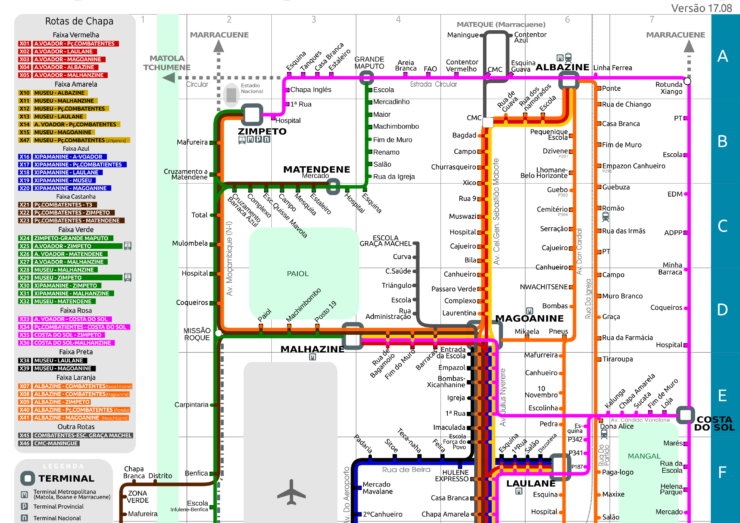
Authors: Joaquín Romero de Tejada
Location: Maputo, Mozambique
Year: 2013
Status: Ongoing
Map Type: Topological
Format: PDF
Project Description
The Chapas Project was started in 2013 by Joaquín Romero de Tejada with the purpose of mapping informal transport infrastructures in Maputo. The data has been collected during fieldwork and is not available to be downloaded. Every year, since 2016, the map is updated.
Map Description
The Chapas Project map is a topological map showing a schematic diagram of the informal transport infrastructures. The bus lines are grouped by colour according to their starting point or route. Bus stops are highlighted and listed, with coordinates and other information.
Candongueiros de Luanda
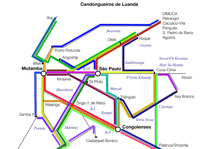
Authors: Development Workshop, Jon Schubert
Location: Luanda, Angola
Year: 2011
Status: Completed
Map Type: Topological
Format: PNG
Project Description
Candongueiros de Luanda is the outcome of a Development Workshop program in 2011. There isn’t any information on how data was collected, it is not available as well.
Map Description
Candongueiros de Luanda map is a topological map showing a schematic diagram of buses routes. Every bus has its own colour. There isn’t any bus stop or Luanda landmark on the map.
Dar es Salaam Dala Dalas mapping
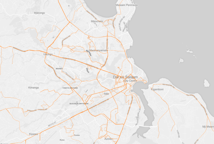
Authors: Dar Ramani Huria, Ally
Location: Dar es Salaam, Tanzania
Year: 2016
Status: Ongoing
Map Type: Thematic
Format: Web
Project Description
Mapping Dala Dalas in Dar es Salaam is a collaboration between Dar Ramani Huria and Ally. This initiative aims to collect information on the informal transports infrastructures and layer them with data already collected by Dar Ramani Huria on the seasonal floodings in the city. The data are collected by members of the community equipped with tools like OpenMapKit and OpenDataKit. The data are then processed by Dar Ramani Huria and uploaded on OpenStreetMap. Ally helped to format the data on informal transport infrastructures. The data are available on the Dar Ramani Huria website and on OpenStreetMap.
Map Description
There are three demo maps on the Ally website. Each map is based on the same Dar es Salaam thematic map and is showing different information. Two of these maps are showing Dala Dalas routes: the routes are all of the same colour, the information given is which are the most travelled streets by buses. One of these maps is static, the other one is animated, displaying Dala Dalas routes in an unclear sequence. The third map shows the bus stops, for each of them is not specified which bus line stops there.
Transports au Mali
Authors: JungleBus, OpenStreetMap community of Mali
Location: Bamako, Mali
Year: 2017
Status: Ongoing
Map Type: Thematic
Format: Web
Project Description
This mapping initiative was started by the JungleBus founder and the OpenStreetMap community of Mali. The project aims to map as much as possible Sotrama routes to give Bamako population better information on the informal transport infrastructures. The wiki doesn’t describe how the data is collected. It can be assumed that the data collection is a grassroots collection done by OpenStreetMap users who then update the website. The data are available to be downloaded from OpenStreetMap.
Map Description
The map is a thematic map: Dala Dalas routes and stops are displayed on Bamako city map. The bus lines have different colours and names. It is not clear whether different bus lines have been grouped under the same colour and name according to some variables. Two different kinds of stops are displayed: bus stops and taxi stops.
AccraMobile3
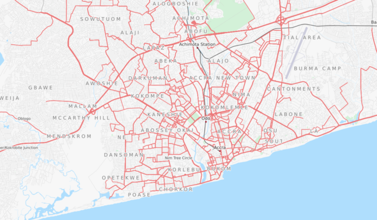
Authors: Accra Metropolitan Assembly, JungleBus, Agence Française du Développement, Transitec and OpenStreetMap community of Ghana.
Location: Accra, Ghana
Year: 2017
Status: Completed
Map Type: Thematic
Format: Web
Project Description
AccraMobile3 was an initiative that involved Accra Metropolitan Assembly, JungleBus, Agence Française du Développement, Transitec and OpenStreetMap community of Ghana. The collaboration lasted from July until September 2017, but it is continued by the OpenStreetMap community. The project aims to map all the routes of informal transport infrastructures in Accra. It is not described how the data are collected, but on the wiki of the project, there are instructions on how to format the data before uploading it on OpenStreetMap. All the data are accessible from the OpenStreetMap website.
Map Description
AccraMobile3 map is a thematic map of the city of Accra. On the map, all the Trotro lines are displayed at once and with the same colour. By selecting a specific route on the right panel, that bus line and its stops are highlighted in a different colour. There aren’t any markers or name to distinguish routes and bus stops.
Technologies used to display data
The data obtained during these projects are mostly displayed in printable transit maps. But some projects keep data also in digital form so that it’s easier to keep the maps updated. None of the projects described has a mobile phone functioning app.
- OpenStreetMap is a collaborative project to create a map of the world. Anyone can edit a map on OpenStreetMap and it is completely open source. However, the primary output of this project is the data that generates.
- Google Maps is a web mapping service developed by Google. The maps are not editable by users since Google is using copyrighted map data for Google Maps. To embed Google Maps in an external website, they launched Google Maps API. With this service is possible to add different layers from the ones provided by Google.
Both map services have been used in two different ways. Some projects only display the data they have, combining these map services with other tools. Other projects store the data using these map services and keep everything updated with them.
Other tools are
- MapBox is a provider of custom online maps for websites and applications. Their data sources are OpenStreetMap and NASA.
- OpenLayers is an open source JavaScript library for displaying map data. It provides an API for building rich web-based geographic applications.
Moreover there are also consortia of geo-data related tools. None of the projects above involved them, but we found them during the research:
- Open Source Geospatial Foundation is a non-profit and non-governmental organisation whose mission is to support and promote the collaborative development of open geospatial technologies and data.
- Open Geospatial Consortium is an international not for profit organization committed to making quality open standards for the global geospatial community. These standards are made through a consensus process and are freely available for anyone to use to improve sharing of the world’s geospatial data.
Technologies used to collect data
Most of the projects described used GPS Mobile Apps to collect information about informal transports. In projects were grassroots users or large communities are involved, it is not specified how the data is collected.
- OpenMapKit is an extension of OpenDataKit. It allows users to create mobile data collection surveys for field data collection.ODK tools allow everyone to create offline mobile surveys to collect field data. The data are then uploaded to a server when the mobile phone is online again. OMK extension is an android mobile application for browsing OpenStreetMap features to create and edit OSM tags.
- Open GPS Tracker is a small device which can be plugged into a prepaid mobile phone to make it a GPS tracker. The Tracker responds to text message commands, detects motion, and sends you its exact position. The tracker outputs a file for Google Maps or any mapping software. The Tracker firmware is open source and user-customizable.
- Gaia GPS and Trails are hiking apps. One of their function is to record the hiking trails and trips that a user follow.
Vocabulary
GTFS: General Transit Feed Specification, defines a common format for public transportation schedules and associated geographic information.s
Thematic Map: a type of map that focuses on a specific theme or subject area. These kinds of maps stress spatial variation of one or a small number of geographic distributions. source
Topological Map: a type of diagram that has been simplified so that only vital information remains and unnecessary detail has been removed. These maps lack scale, and distance and direction are subject to change and variation, but the relationship between points is maintained.
Thursday, April 18th, 2019
Collaboration against disinformation: a summit organised by First Draft
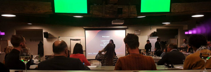
From March 17th to 19th we participated with a group of students to the Collaboration Against Disinformation boot camp held in Milan. It was part of a series of summits across Europe. The summit was organised by First Draft, a non-profit organisation that supports journalists, academics, and technologists working on challenges relating to informational trust in the digital age. The summits aim at intensifying a cross-border collaboration on tackling information disorder as part of the new CrossCheck International Initiative.
The opportunity to participate in this summit comes from the project A Field Guide to “Fake News” and Other Information Disorders, a joint collaboration promoted by the Public Data Lab which put us in contact with First Draft.
DensityDesign Lab was invited to join the three days summit with two goals: share our approach on information visualization and facilitate discussion groups on the topic. The meeting was structured in two main moments: the first part was dedicated to short presentations held by experts from different fields and meant to understand the scale of the problem. After, the approach became more practical and the sessions turned into tutorials and conversations covering the different fields of the opening speeches.
A group of 5 Master degree students (Edoardo Guido, Matteo Banal, Francesca Grignani, Gabriele Wiedenmann and Elena Aversa), 1 PhD candidate (Beatrice Gobbo) and a PhD (Ángeles Briones) from our Lab took part in the event to propose a different method for data-driven research based on visualization. In particular, DD Lab arranged three moments: a speech presenting the findings of a master thesis about the circulation of disinformation through the Italian Facebook network followed by two interactive sessions introducing data collection methods. and visualization tools.
Circulation of disinformation through the Italian Facebook

In the plenary session Elena Aversa presented the finding of her thesis. Starting from a Facebook page sharing disinformation, developed protocols to track the main sources of the misleading news and understand the impact of them on the public. The presentation enabled the research to be shared with the audience of journalists and other experts, starting a fruitful discussion. If you are interested to know more about her thesis, you can visit here the project page.
Track and communicate the circulation of information disorders

During the first session, PhD Angeles Briones went through the different chapters of the Field Guide to Fake News and Other Informational Disorders, presenting how protocols combining digital tools are actually effective in supplying the research. We also wanted to engage the audience on a deeper level, letting them try and use some of the tools mentioned in the Guide. The result was an interesting discussion about how participants’ own research could be developed and enriched through such methods.
Simulating recipes

The second session, held by PhD candidate Beatrice Gobbo, was even more interactive for the audience: mainly focused on the use of CrowdTangle, Netvizz, and RawGraph, combined them in a short tutorial to address a simple data collection and visualization. This hands-on approach helped some of those present to actually visualize their own datasets at the end of the meeting.
The summit ended with a speech dedicated to the CrossCheck platform launched by First Draft. This is an online collaborative verification tool bringing together several partners around the world and created to accurately report false, misleading and confusing claims that circulate online.
This boot camp gave us the possibility to share knowledge and work with experts from different areas and represented another occasion to understand the fundamental role that data visualization have in the analysis, comprehension, and explanation of social phenomenons.
Monday, November 20th, 2017
FaST – Fashion Sensing Technology

FaST – Fashion Sensing Technology is a project meant to design, experiment with, and implement an ICT tool that could monitor and analyze the activity of Italian emerging Fashion brands on social media. FaST aims at providing SMEs in the Fashion industry with the ability to better understand and measure the behaviours and opinions of consumers on social media, through the study of the interactions between brands and their communities, as well as support a brand’s strategic business decisions.
After a crisis that deeply hit Western economies and revealed the weaknesses of previous paradigms, the current challenge – for a mature sector like Fashion – is to reconnect social communities with their territories and their material culture. The tremendous potential created by a new generation of technologies – including digital production, social media and IoTs – offers powerful tools to pursue these goals.
Given the importance of Fashion as an economic and cultural resource for Lombardy Region and Italy as a whole, the project aims at leveraging on the opportunities given by the creation of an hybrid value chain fashion-digital, in order to design a tool that would allow the codification of new organizational models. Furthermore, the project wants to promote process innovation within the fashion industry but with a customer-centric approach, as well as the design of services that could update and innovate both creative processes and the retail channel which, as of today, represents the core to the sustainability and competitiveness of brands and companies on domestic and international markets.
***
FaST – Fashion Sensing Technology is a project supported by Regione Lombardia through the European Regional Development Fund (grant: “Smart Fashion & Design”). The project has being developed by Politecnico di Milano – Design dept. and Electronics, Information and Bioengineering dept. – in collaboration with Wemanage Group, Studio 4SIGMA, and CGNAL.
Wednesday, July 26th, 2017
“Data Walk” workshop – by Yanni Loukissas
Dear readers, the following post is a description of the outcomes of our latest experimental workshop held in May 2017 in Politecnico di Milano.
We’ve been lucky enough to have on our side Yanni Loukissas (from Georgia Tech), who not only outlined the structure of the experience and led the classes, but was even the writer of what is down here, so to him goes our most sincere thankfulness.
Enjoy the reading!

Overview
How can design put data in its place?
During a week in early May, I led a workshop at the Politecnico di Milano to investigate this question. A group of twenty-nine Communication Design students participated. They worked in small teams to explore the design opportunities and challenges posed by situating data in an unfamiliar setting: a walk.
Today, in 2017, we often think of data and place as being independent of one another (Loukissas 2016). Data are infinitely small, technical, and abstract while places are spatial, social and experiential. Nevertheless, data and place are linked. Indeed, “data walk” is not an oxymoron. For data can only be made and made sense of in places of production and display.
Data don’t live on the head of a pin, or a hard drive. Easy enough to say. Over the course of five days, I asked students to show how data and place are connected by designing walks that would take us through both data sets and data settings. Walking became the algorithm that allowed us to connect data and place in a series of surprisingly evocative encounters.
Student projects explored how practices of both collecting and displaying data might be critically reimagined through the structure of their walks. Walks gave rise to creative data collections: unconscious head motions, street stickers, discarded cigarette butts, minute changes in the skin. Walks also placed those data within and around the Bovisa campus of the Politecnico as: a prosthetic for walking, a soundscape, an ironic art installation, and a self-monitoring app. This range of rigorous and whimsical experiments helped us all reconsider the relationship between data and place.
The “Data Walks” workshop would not have been possible without the invitation and support of Paolo Ciuccarelli, professor and director of Communication Design at the Politecnico di Milano and Tommaso Elli, my teaching assistant and guide to Bovisa for the week. Additional thanks to all the members of Density Design Lab, who provided inspiration, moral support, and feedback.
The workshop was structured by a pair of exercises. Both explored the relationship between data and place, but in different ways:
Exercise 1. Walking for data collection
In the first exercise, students explored where data come from and how they are shaped by specific origins. This was not an abstract exercise. They learned hands-on how to make their own data sets. First, they identified a public route along which to collect data. Then, they selected a neglected or invisible subject encountered along that route as the focus of their data collection. I offered a selection of unorthodox procedures to help students develop reflexive collecting practices, such as “don’t categorize,” “use irregular measures,” “note absences,” “rely on your judgment,” and “record your own presence.” Students created and stored data using Flickr (a web app which captures images + metadata tags). Each data set captured (in its own way) what the original route looked like from the perspective of the selected subject. In the process, students learned just how human data collection can be.
Exercise 2. Walking for data display
In the second exercise, students considered the context in which new audiences might encounter their original data set. In this follow up assignment, students learned how data are affected by local settings for display. Still working in groups, they created short (~5 minute) data walks using the sets collected in exercise 1. Their data walks were both physical and informational traversals. They simultaneously took us through spaces and through a data sets, calling attention to the relationship between the data and its surrounding context. Each group choose a procedure to help shape their walk: “narrate,” “materialize,” “participate,” “layer,” or “zoom.” The results were evaluated on three criteria. Concept: what does the data walk help us learn about the local setting? Experience: what does the data walk feel like? And technique: how is the data walk made?
Outcomes

(Image by Tommaso Elli)
———
Your light data project
Team: Nicolò Fabio Banfi, Sofia Chiarini, Giulia Corona, Alessandra Del Nero
Group 1 collected data about the play of light and shadow on a walk through the Bovisa campus. They devised a prototype mobile app that guided walkers from the main entrance to the design building, assessing variations in lighting conditions along the way. Their data walk prompted us to reflect on how light affects our bodies, through changes in the look, feel, and underlying processes within our skin.

———
Decoding the street colours
Group 2 created a collection of 360-degree photographs, taken at points along the path from the Bovisa train station to the steps of the design building, then deconstructed those photographs into a series of place-based color spectra. Finally, the group assembled the spectra into an imaginative walking guide to the colors of Bovisa.
Team: Long Zhang, Valeria Brienza, Teng Yilin, Margot Llobera

———
Watch your butts
Team: Barbara Nardella, Francesco Cosmai, Francesco Giudice, Giulia Zerbini
Group 3 gathered discarded cigarette butts and displayed them ironically as annotated art pieces along the promenade from the Bovisa train station. A 2015 Italian law recently redefined cigarette butts discarded in the street as “trash.” The group’s data walk prompted us to reflect on the general category of trash and the specific stories that individual cigarette butts might tell.

———
Hyperglue
Team: Valeria Sonia Aufiero, Andrea Benedetti, Simone Costagliola, Alessandro Zotta
Group 4 assembled data on street stickers posted by local bands around Bovisa and subsequently reimagined those stickers as nodes in a sound walk. In their working prototype, each sticker functioned as a virtual speaker that diffuses music. As you got closer to a band’s sticker, the volume of their track increased. When you walked through areas dense with stickers, multiple music tracks played over one another, creating an unexpectedly entertaining cacophony.

———
Museum of details
Team: Alicia Gonzalez, Emanuele Innocenti, Nikita Kulikov, Ludovico Pincini, Yining Zou
Group 5 led us on a circular walk through a “museum of details” composed of artifacts left on the balconies surrounding a prominent round-about in Bovisa. The project encouraged interactions between walkers and owners of the artifacts through the use of a simple augmented reality experience and postcards, which invited comments or even offers to purchase the artifacts left out for view.

———
Mind your step
Team: Sara Batisti, Vincenzo Bisceglia, Nicola Cerioli, Mattia Virtuani
Group 6 asked us to attend, reflexively, to the way we walk. How often do you watch your feet? Are you aware of your surroundings? Using the accelerometer in an iPhone in coordination with a GoPro, the group constructed an effective method for reflecting on one’s walking habits during the daily commute from the Bovisa station to the Politecnico gates. (Team: Sara Batisti, Vincenzo Bisceglia, Nicola Cerioli, Mattia Virtuani)

———
Behind
Team: Alessia Bissolotti, Mara Cominardi, Serena Del Nero, Marco Mezzadra
Group 7 led us on an archeological investigation of cracks in the architecture of Bovisa, and prompted us to consider their significance as markers of both historical and environmental change. Their prototype mobile app treated cracks as opportunities to peel back the surface of the city and peer into its past.

———
Dipartimento di Design, Politecnico di Milano
May 8-12, 2017
Post by Yanni Loukissas (Visiting Instructor), special Thanks to Paolo Ciuccarelli (Program Director) and Tommaso Elli (Teaching Assistant).
For more information on this workshop and other activities hosted by the Local Data Design Lab, contact http://yanni.loukissas@lmc.gatech.edu
Monday, May 23rd, 2016
“From Mind to Reality” Workshop

The week of May 2nd we experimented a new workshop format, engaging students with different backgrounds – Communication Design, Product Design, Design & Engineering – asking them to design and prototype an object able to make live data streams “tangible”.
The aim of the workshop was to experiment the potential of combining rapid-prototyping techniques with information visualization knowledge, trying to go beyond the “flat” nature of information visualization.
Each students team identified a live datasource (e.g. personal social network feed, real-time environmental data, personal services…) and created a tangible experience of the data exploiting the potential of materials, structures and shapes.


Students had at at their disposal the Polifactory space and machineries (3D-printers, CMC laser cutters etc.).
Despite the short time at disposal, all the groups managed to create a working prototype connected to a data stream. Below you can see the results.
I would like to thank Fondazione Politecnico for having made possible the workshop, and Polifactory staff for their active support to students, and for the spaces. Finally i want to thank Monica Bordegoni and Marina Carulli who co-tutored the workshop with me.
Results
Each group developed a working prototype, and we asked to create a shor video presenting the project. below you can see the results.
BeWave
Chiara Riente, Kacper Pietrzykowski, Lorenzo Positano, Maria Elena Besana, Marius Hölter
Seeklub
Carlo Colombo, Erika Inzitari, Hanife Hicret Yildiz, Maarja Lind, Piero Barbieri
Spotilight
Ghazaleh Afrahi, Jennifer Monclou, Lucia Cosma, Pietro Cedone, Sebastian Forero Hernandez
Twogethere
Twogethere is a clock, made for any couple of people living in the same house, that works thanks to geolocalization. Following the distance of the connected mobile phone, it shows the transfers of a person, who is moving from home or coming back, by the hands. The maximum angle is 180°, that stands for a fixed distance, that could be defined as a city area.
While on the right half the clock marks distances, the left side is a lamp. Its intensity increases when the person is coming back home, meaning that a further distance from it corresponds to less light. When the hand is getting closer to 0° it emits a sound in order to catch the attention.
Students:
Carola Barnaba, Chiara Bonsignore, Delin Hou, Eyleen Carolina Camargo, Qiji Ni
Budgy
Historically, personal finance could be a matter managing the cash in one’s wallet or purse and withdrawing more from an account when it was depleted.
With the advent of the credit card, debit card, paypal and other electronic payment systems, personal finance has become less and less tangible as it becomes more integrated with digital communication and online commerce. It is quite simple to now spend more then intended or have transactions go unnoticed. Our aim is to reconnect the physical world to one’s sense of their personal finance.
We hope to do this by visually and physically demonstrating for an individual their expenditures over the course of one week. to achieve this we will us thousands of small spheres to represent the funds in one’s budget. 1 sphere = 1 euro. A large reservoir of “budget” will be allowed to flow out according to the rate of one’s spending. Not only will one’s expenditures be demonstrated for the seven days, but each day will be individually quantified in “daily” vials and made available for relative comparison at the end of the week. To do this we will use some of the same technologies that helped to remove tangibility from personal finance.
The process begins when our user makes an electronic transaction of some kind. A data stream is created beginning with the users bank, which is configured to provide notifications of any banking activity. This notification contains information related to the time of the transaction, the amount withdrawn and the balance remaining in the account. The message alert is configured to arrive at a web-based mail parsing service hosted by mailparser.io . A rule parses the email for the amount withdrawn and makes it available through an API along with a unique ID code that is used to identify the transaction.
Our device will consist of a reservoir of spheres positioned above a carousel of 7 vials, one representing each of the days of the week. Between the reservoir and carousel is positioned a customized “valve” that precisely controls the deployment of sphered from the “budget”. The carousel motion is actuated by a servo as is the valve. A third servo acts to agitate the spheres and aid in operation.
A NodeMCU running the arduino boot loader provides direct control of all three of the servo motors. Upon powering, the NodeMCU attempts to connect to it’s familiar wireless network. Once a connection is established it immediately connects to a NTP time server to establish the current day of the week. Once this is complete the carousel’s position is set. At this point an Http library and GET function are used to connect to our API at mailparser.io. If a new transaction is detected the value of the expenditure is read and the appropriate number of spheres are deployed. Once complete, the day of the week and API are continually monitored for any updates.
Students
Davide Pedone, Lorenzo Piazzoli, Michael Barocca, Oliviero Spinelli, Pietro Tordini
Nido
@the_polifactory NIDO’s LED lit bulbs represent friends on #socialmedia. Colors are set according to their feelings based on hashtags.
Students:
Andrea Lacavalla, Beatrice Gobbo, Jelena Milutinovic, Karen Rodriguez, Michele Invernizzi
Unstable
Unstable is a domestic object designed to help people, who daily spend a lot of time working on laptop, to control their working sessions.
The idea came from a personal and daily experience, all of us is used to stare at the screen for many hours losing the track of time, but for our health, especially for our eyes, this is not good at all. In fact, there are work policies that say you should have a 15 minutes break every 2 hours of work.
Unstable has the aim to make you realize when it’s time for a break, making you impossible to keep working, because after 2 hours it automatically turns unstable.
Students:
Giulia Piccoli Trapletti, Laura Toffetti, Maddalena Bernasconi, Matteo Montecchia, Riccardo Gualzetti
Lazarus
Sedentary lifestyle is a type of lifestyle with no or irregular physical activity and it’s a growing problem in our society.
In order to fight this bad habit, we connected a stool with personal movements data: if the user doesn’t reach a defined amount of steps, the stool will react by changing shape.
Lazarus, our smart stool, changes it’s flat surface into a series of solids with different heights, this uncomfortable configuration both shows the user that he’s moved too little and forces him to stand up and move.
Students:
Carlo Alberto Giordan, Lucrezia Lopresti, Luobin Huang, Mauro Abbattista, Xiaoqian Liu
Pollenair
Pollenair is a pollution awareness lamp.
The product alerts who owns it about the condition of a city’s air.
The lamp portraits four distinct emotions. Its mood swings are represented by different positions and colours.
Pollenair allows you to know if your city is being eco friendly without even opening your window.
From the data source, the information is collected and transmitted, in live streaming. With the keyboard you can choose a city and compare the numbers of pollution around the world.
Students:
Camila Borrero, Chang Ge, Chiara Cirella, Inês Filipe, Prateek Chopra
- Make 5 Sentences about Saying Disagreement
- Payment Agreement Sample Philippines
- Can Landlord Charge for New Tenancy Agreement
- Spirit Airlines Tax Receivable Agreement
- Ancillary Services Agreement
- Download Agreement by Shanko Rasheed
- Facebook User Agreement Photos
- Music Production Contracts Templates
- Do Contractors Do Financing
- Free Trade Agreement Russia
- Stock Purchase Agreement Good or Bad
- Terminating Employee Contract Early
- It Support Agreements
- Iran Nuclear Agreement Terms
- Rental Lease Agreement for Ct
- Tcode for Display Contract Status
- Contracts Manager Jobs in Bangalore
- Behavioral Health Contractors Association
- User Agreement in Arabic
- Rcuh Agreement for Services