Last October a small delegation of former DensityDesign students participated at Fall Data Sprint held by Digital Methods Initiative at the University of Amsterdam, a workshop part of EMAPS Project (Electronic Maps to Assist Public Science).
The DMI is developing an ongoing mapping project focused on climate change and leading approaches (and phases) to its study, namely climate change skepticism, mitigation and adaptation. In this workshop they moved towards what could be interpreted as a fourth phase: climate change and conflict.
The workshop envisaged projects concerning the actors and issues, future scenarios and climate fictions as well as the places of conflict. Are there leading scenarios about the coming conflicts (e.g., having to do with refugees, water, and other sources of distress), and whose scenarios are these? Who are liable to be the victims? Where do these conflicts take place? We were also interested in the part played by so-called cli-fi, or climate change fiction. To what extent is fiction, and the imagined futures, organising the issue space?
We took part in two of the three projects realized as visual designers.
Climate Fiction (Cli-Fi)
The first project explores cli-fiÔÇöfiction about climate changeÔÇöin order to understand and categorize fictional scenarios about the future, and the role of human actors in those scenarios. This project uses digital methods to gather data from Amazon and Google Books, in conjuction with manual classification, in order to understand the current zeitgeist of climate change in fiction.
Mainstream discourse suggests that the cli-fi genre aims to humanize the apocalyptic scenarios associated with climate change, and make relatable their potential outcomes:
ÔÇťMost of the authors seek, at least in part, to warn, translating graphs and scientific jargon into experience and emotion…The novels discussed here do something valuable, too. They refashion myths for our age, appropriating time-honored narratives to accord with our knowledge and our fears. Climate change is unprecedented and extraordinary, forcing us to rethink our place in the world.ÔÇŁ (Dissent Magazine)
We chose to investigate these two claims: What kind of scenarios does climate fiction depict? What kind of personal, aesthetic, and emotional experiences does cli-fi it putting forward, and what ‘myths’ does it is refashion?
In order to answer these questions we visualized each cli-fi book’s cover in terms of their scenario and associated issues. The outcome will be an ‘atlas’ of cli-fi places in terms of their scenarios.
When clustering the blurbs of climate fiction books ÔÇťglobal warmingÔÇŁ and ÔÇťclimate changeÔÇŁ were central and seemed to be drivers of the narrative. This puts into question the statement about the normalization of climate change and it being backgrounded on the narratives.
The books appear to share not the details of how these future scenarios look like, but were closer in terms of the personal narratives they introduced. A further step would be to identify and classify in terms of the archetypes of this narratives using a framework (journey back home, searching for the lost land).
In terms of the scenarios depicted they were common themes: global warming, destroyed cities and flood.
When exploring what characters in the book ten to remember included: cities, easier times when fuel was available and the everyday geography that is in their present times gone.
The second project we took part in dealt with the climate conflict vulnerability and victims.
Mapping Climate Conflict Vulnerability and Victims
What are the countries most and least vulnerable to conflict as a result of climate change?
How prominent are these countries in the online issue space of climate change and that of its sub-issues (demarcated through their vulnerability indicators)? How does this resonance vary across online issue space, looking at a countryÔÇÖs resonance within climate change on Google.com, Google News, Twitter (set of one year of climate tweets 22 Oct 2012 – 22 Oct 2013), and within UN General Assembly reports on climate change (dating from 2002-2012)?
How does the issue imagery of climate change (using Google Image results) address these vulnerability indicators? Do we see adapted or vulnerable landscapes? And is the issue humanized (showing people, animals and landscapes) or quantified (in scientific stats and graphs) in imagery?
The first step to address these problems consisted in collecting lists of countries, ranked by their vulnerability to climate change. For this, we have used three indexes with recent data: DARA’s CVM (2012, data from 2011), Germanwatch (2013, data up to 2011), GAIN index (2012, data from 2011). We triangulated the lists and found the countries most and least affected by climate change. For Gain and Germanwatch, we selected the top and bottom 50 countries. For Dara, we used ‘acute’ for the most vulnerable, and ‘moderate’ for the least vulnerable. Subsequently, we have created a world map indicating the least and most vulnerable countries.

Figure Three: Climate Vulnerability World Map
On the world map (Figure Three), the most vulnerable countries (in purple, occurring in all three lists) are located either in Africa or Asia. Very vulnerable countries (in red, occurring in either two of the lists) are also located in the same regions, mostly West African and Southern Asia. Other vulnerable countries (in pink, appearing in at least one list) are more spread out: from South America through Central Europe to Southern Asia.
The most resilient countries (in blue, also appearing in all lists) are also relatively dispersed: Northern Europe, Western Europe, Southern Europe, North Africa and the Middle East. Other resilient countries (in green, occurring in either two of the lists) seem to be mostly confined to Northern and Western Europe, but a few of them are also located in South America, Africa and Asia. Another group of resilient countries (in yellow, appearing in at least one list) is also quite diverse, to be found in regions such as Russia, Southeastern Europe and Western Asia, but also South Africa or Latin America.
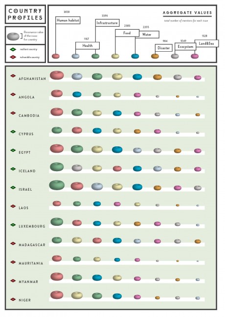
The country profiles have been visualized on a separate chart (Figure Four), in which each sub-issue is visualized as a ring, resized according to the resonance of the shortlisted countries within that specific sub-issue. The map shows an aggregate value for each sub-issue on the top right. Each country then is profiled according to its resonance within sub-issues, which are sorted from highest resonance to lowest resonance.
The diamond-shaped labels indicate whether the country is considered vulnerable (red) or resilient (green).
The profiles demonstrate that the countries resonate most within the sub-issue space of Infrastructure and Human habitat. Food and Water are other consistent sub-issues across countries. Health seems to be specific to Afghanistan and Israel, whereas Ecosystem is specific only to Iceland.
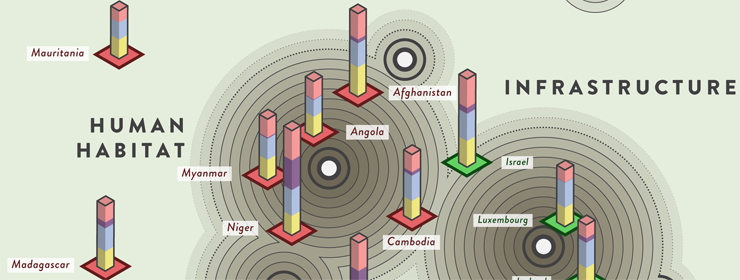
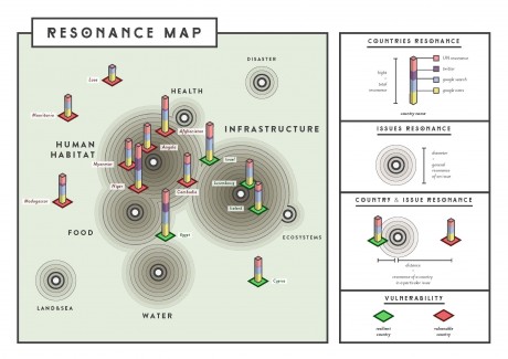
Subsequently, for each country the resonance in the various issue spaces (Google, Google News, Twitter and UN documents) is visualized in a ÔÇśresonance barÔÇÖ. These resonance bars are placed on a footer that is either green (resilient) or red (vulnerable). With Gephi, a network graph is made of all issues and countries, where only the strongest links are retained to position the countries in relation to their ÔÇśtiesÔÇÖ to a sub-issue. The diameter of a sub-issue shows the cumulative resonance of the set of countries for that sub-issue. The relative position of the countries refers to the commitment of a country to a particular issue (Figure Five).
Overall, it shows that Infrastructure is an concern of resilient countries, and Human habitat is a concern of vulnerable countries. Furthermore, positioning the sub-issues based on the cumulative resonance, reveals the close relation of Health and Food with the sub-issue of Human habitat.
The Tree Maps that follow visualize the results of the climate change related Google Image searchs according to the index we listed above.
These The most dominant subset of climate change related images according to Google Images is ÔÇśLandscapesÔÇÖ, ÔÇśScienceÔÇÖ and People. The most prominent subcategory within the landscapes was imagery related to disasters, followed by land&sea (floating icebergs).
In addition to the quantification of the number of images into the Landscapes, Science, People, Animals, Cartoons, Literature, Metaphors and Other categories, we decided to zoom in on the Landscape imagery, which was translated, visually, into an Issue Landscape comprising panoramic representations of each indicator, grouped according to the subject matter shown in each image.
Here, further analysis could be done of the resonance of countries per online issue space, and per sub-issue. The resonance per sub-issue could then be compared to the ÔÇśhot spotsÔÇÖ defined by the vulnerability indexes per variable (as listed in GAIN and DARA). Furthermore, additional sources could be used, such as blogs.
Another issue that deserves continued research concerns the countries that occurred as both vulnerable and resilient in the triangulated lists (see above, in a lined pattern on the vulnerability map). Such countries – US, Brazil Germany, Italy and Australia, among others – could have been scored both negatively and positively because of the very different indicators used by the sample indexes. For instance, Germanwatch focused on the effects of extreme weather, as quantified through human and financial loss, while GAIN and DARA captured other factors, such as health, infrastructure, habitat and ecosystems. Thus, it would be interesting to see, per sub-issue, why a country can rank both low and high, and also whether this contradiction is reflected by the Web.
Team: Federica Bardelli, Gabriele Colombo, Carlo de Gaetano, Stefania Guerra, Tommaso Renzini


[…] Visualizing Climate Change and Conflict | Density Design […]
November 30th, 2013 at 7:01 am[…] Visualizing Climate Change and Conflict | Density Design Last October a small delegation of former Density Design students participated at Fall Data Sprint held by Digital Methods Initiative at the University of Amsterdam, a workshop part of EMAPS Project (Electronic Maps to Assist Public Science). Stefania Guerra presents some of projects developed during that workshop. […]
November 1st, 2014 at 2:24 pm