We’re just back from a speech at the Human Cities Symposium, in Bruxelles.

Human Cities is a network of professionals dedicated to research, action and information on spatial, social and political innovation pertaining to public space.
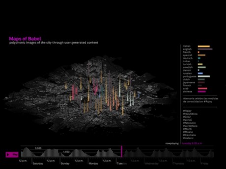
We presented a paper, called Maps of Babel, within the methodological section, that focuses on the methods as well as the theoretical frameworks mobilized by researchers to observe, describe, understand, assess, theorize and/or spread interpretations and actions on the topic of “humancities”.
Maps of Babel is one of the experiments we’re conducting in the field of urban sensing and data visualization. Within this field, our ongoing applied research aims at designing a new method for interpreting, crossing, analyzing and visual representing digital traces, as well as User Generated content at the urban scale. The final goal is to return dynamic alternative polyphonic images of the city as it is used and perceived by its inhabitants.
You can find the preview of the Speech here.
The experiment has been carried within a multidisciplinary and extra-department team of collaborators (Paolo Patelli from Urban Planning Department of Milan Politecnico; Luca Simeone from Medea University, Malmoo; and Salvatore Iaconesi from La Sapienza, Roma).
As you can see from the speech preview, the experiment tried to understand patterns of how different groups live the city in terms of spatial distribution (correlation with specific places and areas), and temporal distribution (time of the day, days of the weeks) inquiring the contributions between people that post in different languages.
I (Giorgia Lupi) was speaking at the conference presenting the background, the methods and some first results.
As we see it, presenting our work in front of an urbanist and planning based audience, should have been useful to gain insights (and critics) on how to properly integrate those data with other quantitative and qualitative ones; or to discuss on the effective utility of this research in terms of decision making processes and planning at the urban scale.
Unfortunately, we were not able to do it. In fact, my intervention unleashed a hot debate on a completely different topic: the ethic issue of showing User Generated Content.
“data are private! you cannot use them in that way!”
“there must be an ethic debate around it”
“those data could be mis-used by the authority!”
“we felt very scared seeing your presentation / we were dots on the map! it’s scaring!
“it’s urban marketing, companies can use these data against our cities!”
In 2012 we didn’t expect such a reaction.We feel that everybody should know that what we everyday share on blogs and social networks is public, if not kept private on purpose.
As we see, it’s not by avoiding to visualize these kind of public data that prevents us from any mis-use by the authorities or the company; everybody already has access to these data and that’s because they’re public! Obviously the debate around what’s private and what is not is very slippery at the moment; we deeply believe though that people involved in urban planning and decision making should start taking into account that those data exist, that there’s a new layer of information that we cannot turn our heads away from.
Anyway a lot of positive comments have been collected within the debate (that I’m personally happy to have generated!).
Starting from our research, it has been enlightened the importance of the role of designer in helping people (planners and citizens) to understand: transforming those data into stories, and making those data collectively explorable; as well as the possibility to generate awareness on people just because we make what they share visible. Other interesting comments have been done on the possibility to make a step forward in thinking the concept of the actual public space.
I particularly appreciated the conclusions on the panel, held by Matej NikšiÄŤ, (Urban Planning Institute of the Republic of Slovenia) which enlightened that the central question should be how those data can become really useful in making us better deal with our cities and not how we can save us “from the Man”.
I thought it was really interesting. Most of all the perspectives that are raised by those kind of mapping. For me the most usefull comment was about the fact that that you could imagine both best and worst case scenarios of how the data can be used.
March 21st, 2012 at 9:14 am[…] https://densitydesign.org/2012/03/densitydesign-in-bruxelles-when-visualization-meets-other-disci… […]
May 10th, 2012 at 2:56 pm[…] Comment to the the speech on the DensityDesign website (link) […]
May 12th, 2012 at 3:55 pm