The brazilian news site EstadĂŁo.com.br created a sankey visualization that analyzes the composition of the national football teams partecipating the world cups from 1994 to 2010.
Thanks to this visualization it is possible to understand the import and export rates of each national team: it is in fact possible to relate the composition of the national teams with the ones of the clubs, divided by country.
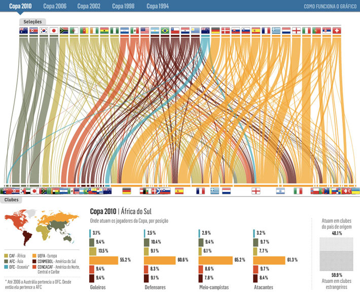
Sankeys are indeed a great way to visualize flows and/or distribution: they are able to give back a general idea of the relative quantities of these flows.
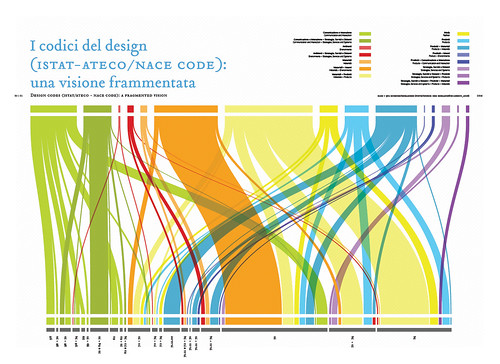
Back in 2008 we did a similar work for DRM, a publication about the state of design research in Italian universities and schools.
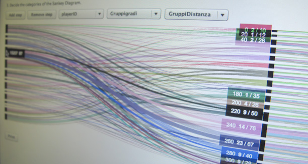
In this case it is only a matter of distribution, but in another project, done for Politecnico di Milano, we developed a visualization that represented students flows during their academic career.
In this way it is possible to analyze how students behave. Do they change specialization from the B.A. courses to the M.A.? What kind of marks do they get? Do they find internships in their same area of specialization?


We are now working on a flexible Sankey generator tool, capable of visualizing both distributions and flows. The project is still ongoing, more news are coming soon!